The portrait wallpaper pool exists because of a mistake I made when I launched the site earlier this year. I generated the entire first batch of wallpapers in landscape, because I was thinking about the 24/7 stream, which broadcasts at 1920×1080, and desktops, which is what I personally stare at all day. Then I looked at the analytics and a large chunk of visitors were on phones, dutifully downloading 16:9 images that were going to get butchered by a vertical crop. So I rebuilt the generation pipeline for native 2:3 portrait, re-ran the themes that made sense vertically, and spent an unreasonable number of evenings setting each one as my own lock screen to see which survived actual daily use.
This post is the result of that testing. Ten Japanese-inspired picks, all AI-generated with Stable Diffusion XL, all free for personal use — no signup, no watermark, download and go. They work on Android and iPad too, but I tested on an iPhone, so that’s the lens here.
What I learned about “pretty” versus “usable”
Here’s the thing nobody tells you about wallpapers: the image you’d hang on a wall is usually the wrong image for a phone. A dramatic sunset temple is gorgeous for the four seconds you look at it, and then it spends the rest of its life fighting your notification badges for attention and losing. When I curated the portrait pool I kept killing images I genuinely liked because they were too loud to live behind app icons.
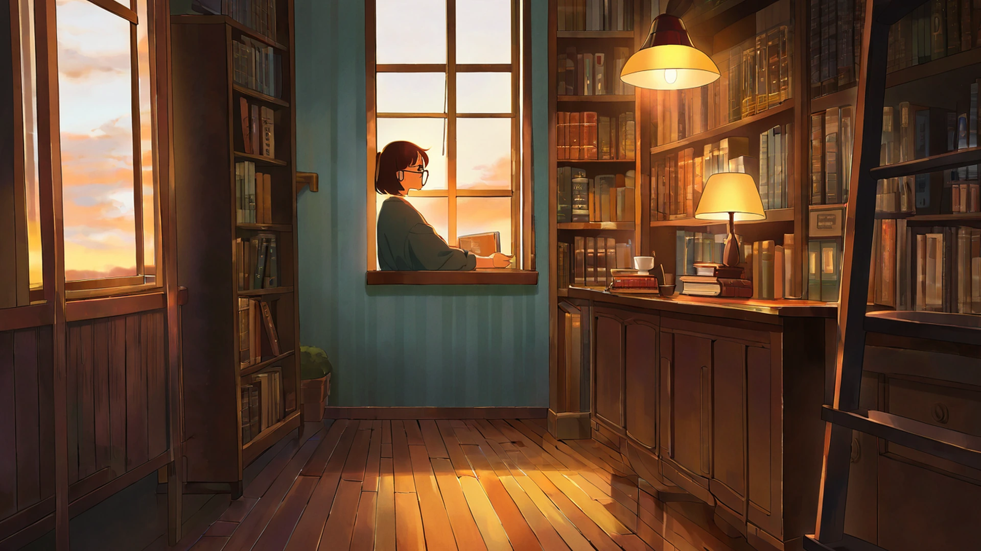
What survived was a specific mood — the quiet end of the Japanese and Ghibli-adjacent aesthetic. Calm enough not to distract, warm enough to feel like somewhere you’d want to be, detailed enough that it doesn’t read as a stock gradient. It’s the same reason the lofi girl studying by a window image became the visual shorthand for an entire genre. It recedes. My test was blunt: if a wallpaper still annoyed me after three days of real use, it didn’t make this list.
The ten that stayed on my phone
The one I kept longest is Cherry Blossom Path — a quiet walkway lined with sakura in full bloom, with the vertical composition pulling your eye up through the trees toward a small temple in the distance. It’s also one of our most-downloaded themes across every format, so apparently my taste isn’t unusual here.
For evening use, my honest recommendation is Lantern Festival Night: thousands of glowing paper lanterns against a deep blue sky. The warm tones don’t stab your eyes at low brightness, which matters more than I expected — I check my phone in the dark more than I’d like to admit. In the same night-friendly family sits Shrine Torii, classic Shinto gates rendered in morning mist, golden hour, and starlight. The portrait framing lets the gate dominate the frame the way it’s actually meant to be seen; the landscape versions never quite did it justice.
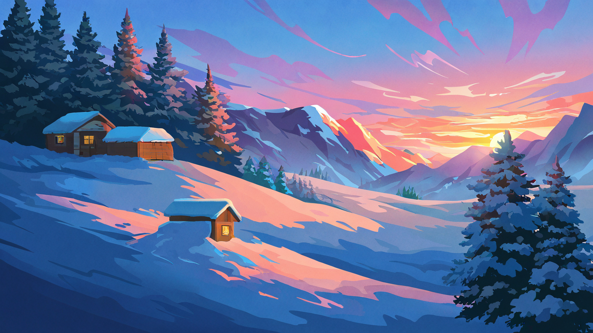
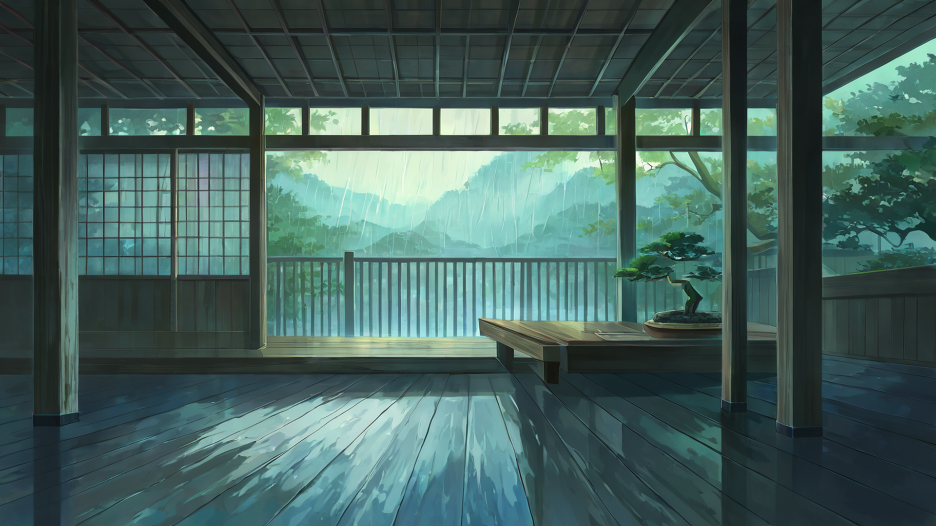
The most meditative subject we’ve generated, by some distance, is the Rainy Engawa Porch. The engawa is the traditional wooden veranda wrapping a Japanese house — add light rain, wet stones, and soft lamplight from inside and you get something I’ve had people mention specifically in the stream chat. Seasonal moods are covered by Snowy Mountain Village, steep roofs dusted in snow, which I rotate in when the weather outside my actual window matches, and Autumn Maple Village, red and orange maples around wooden houses with stone paths and distant mountains. Those maple oranges look especially rich on OLED iPhones — more on why below.
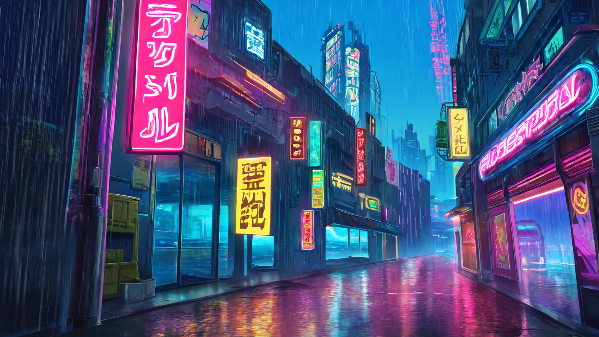
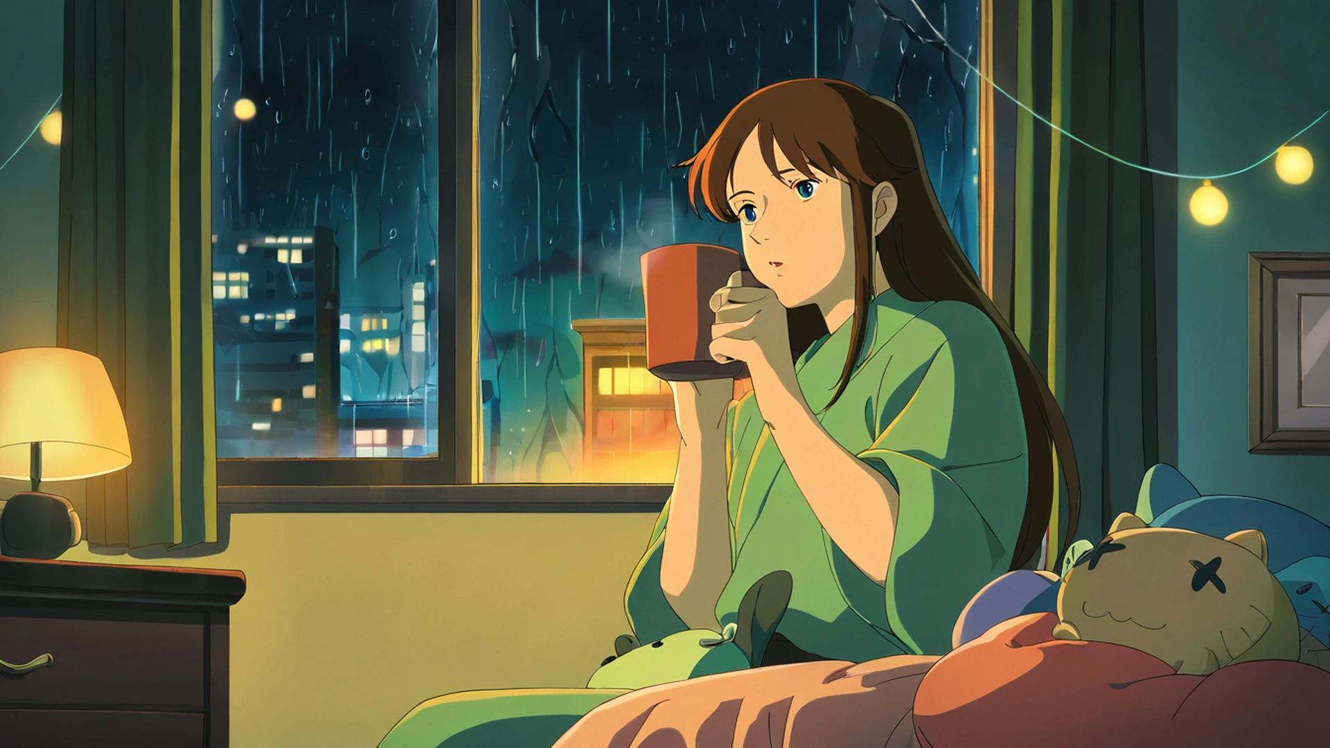
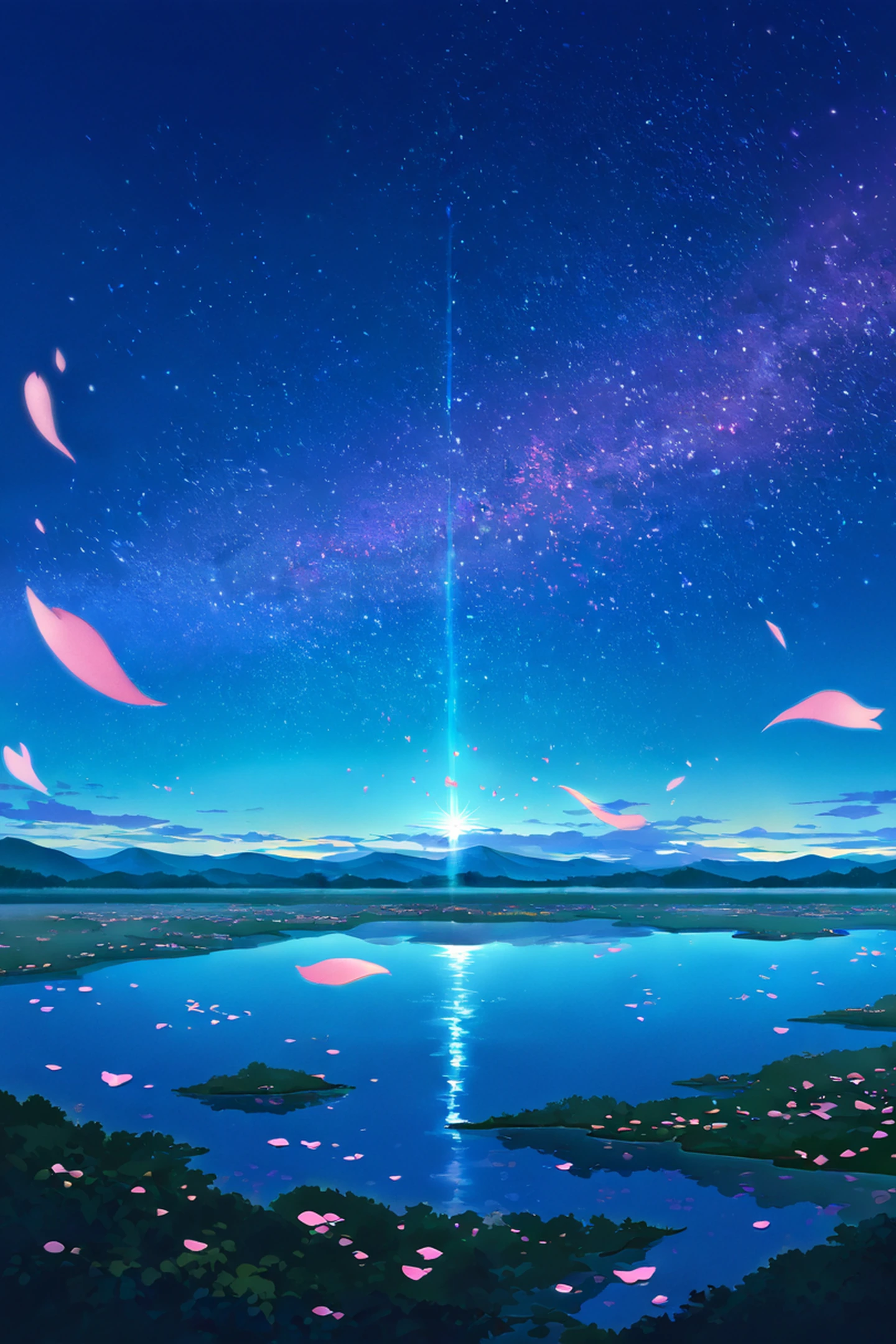
If you want a character in the frame, Girl Studying by Rainy Window is the series to browse: a girl at her desk, headphones on, rain tracing the glass behind her. Very much the energy of the YouTube radio streams this whole project descends from. For people who prefer city over nature, the Night Market theme does neon signs, paper lanterns, and wet pavement reflecting it all back. My own soft spot is the Cozy Bookshop set — warm shelves, reading lamps, and usually a cat hiding somewhere in the scene; the portrait crop makes it feel like you’re standing inside the shop. And the tallest compositions in the whole pool belong to Stargazing Hilltop: deep blue skies, constellations, often a small figure watching from below, built to fill the full height of a modern phone.
Every one of those links goes to a download page where you pick the exact resolution for your device — iPhone 15 Pro Max, iPhone Pro, modern Android, iPad Pro, plus Pinterest 2:3 if you’re a collector.
Setting it up, and the resolution question
Once you’ve saved a file (tap and hold the image on the download page to send it to Photos), the path on iOS is Settings, then Wallpaper, then Add New Wallpaper. Tap Photos, pick the saved image, pinch or drag to frame it — in my experience the default framing already fits, because we cropped these for phones in the first place — then tap Add and decide whether it goes on the Lock Screen, the Home Screen, or both.
Our portrait wallpapers come down at 1440×2160 by default. I picked that size deliberately: it covers everything from the SE to the Pro Max without visible cropping in the center of the image. If you want the Pro-Max-native 1290×2796 instead, it’s in the resolution list on each wallpaper’s page.
The part where your phone’s screen actually matters
Most “best iPhone wallpapers” posts treat the phone as a dumb picture frame. It isn’t, and I learned this the annoying way — a wallpaper that looked great on my desktop monitor looked murky on my phone at night, and I wanted to know why. Three hardware details explain most of it.
First, OLED versus LCD. Every iPhone from the X (2017) onward except the SE generations uses an OLED panel, where individual pixels switch fully off instead of being backlit. Pure black is genuinely black, not glowing dark grey. For this collection, that matters most on the themes built from deep blues and near-blacks — the torii tunnels, the lantern festival, the night scenes. On OLED they have real depth. On an LCD SE they look slightly milky, because the backlight leaks through. If you’re on OLED, the night themes are where the panel earns its price.
Second, ProMotion, the 120 Hz refresh available on iPhone 13 Pro and later. It doesn’t change how a static image looks, but it does change how iOS handles transitions and the depth effect introduced in iOS 16. Wallpapers with a clear focal subject — the girl at her desk, a central torii, the moon in a stargazing scene — get parsed as multi-layer compositions, and the lock screen can pull the subject in front of the clock. It’s a genuinely nice effect. Wallpapers without a subject, like rice fields or gradients, get almost nothing out of it.
Third, always-on display, on iPhone 14 Pro and later. When the screen dims for always-on, iOS runs a darkening pass over the wallpaper to keep it readable without cooking the OLED. This was my murky-wallpaper mystery: images that depend on bright highlights — sunset rice fields, snowy village — get their highlights crushed by that pass and turn to mud. Images that are already dark and low-contrast, like the rainy engawa or the lantern festival, just get slightly darker and survive gracefully. If you run always-on, lean dark.
One practical trick I use myself, which I’ve never seen Apple document clearly: your lock screen and home screen wallpapers can be completely different images. My current setup is a subject-forward portrait on the lock screen — the studying girl, or a shrine_torii crop — and a quieter ambient scene like the rainy porch on the home screen. The lock screen gets the visual interest for the two seconds you check the time; the home screen stays out of the way while you actually use the phone.
And if you’re on iOS 17 or later, you can go further and tie wallpapers to Focus modes, or schedule them by time of day. I point the rainy porch engawa and bedroom window night themes at Sleep Focus, and the coffee shop morning or rice fields summer themes at Work Focus. It’s a small visual cue about which mode the device — and I — should be in, and it costs nothing to set up.
If you want more than ten
We keep adding portrait themes as I generate new batches, so the full portrait collection is always a bit ahead of this post. The landscape desktop collection is on the homepage if you want your monitor to match your phone. Everything is free, no account needed, and every wallpaper page offers sizes for iPhone, Android, iPad, MacBook, Ultrawide, and Pinterest out of the box.