There is a common mistake people make when picking a wallpaper, and it is the same mistake design students make when they first try to compose a layout: they fill the frame. A wallpaper with a beautiful subject sitting comfortably in the center, framed by detail on every side, surrounded by colour and texture — it looks rich and considered in a thumbnail preview. Then you set it as your desktop background and within a day you notice you are vaguely tired. The screen does not feel restful. Why?
The answer is that wallpapers are not paintings. They are not meant to reward sustained attention. They are meant to receded into the environment of work, and the property that lets an image recede is, almost entirely, negative space — the parts of the frame that are deliberately left empty, simple, or low-detail. Japanese visual tradition has a specific name for this principle, ma (間), and it is one of the reasons that wallpapers in the Japanese aesthetic feel calmer than equivalently-priced or equivalently-skilled wallpapers from other visual traditions. Once you start seeing ma, you cannot un-see it. And once you can see it, picking the right wallpaper becomes much easier.
What ma actually means
Ma is one of the small handful of Japanese aesthetic words that does not translate cleanly into European languages. The closest English equivalents are “negative space,” “interval,” “gap,” or “pause,” but none of them quite capture the concept, because ma is not the absence of something — it is the active presence of an interval. Think of the silence between two notes in music, the pause between two phrases in a conversation, the empty section of a tea house wall behind a single hanging scroll. The interval is doing the work; the surrounding content is what defines the interval, not the other way around.
In visual composition, ma is the empty area of the frame — the open sky, the empty plain, the unmarked wall, the area of mist where nothing is happening. In traditional Japanese paintings, prints, and interior design, ma is treated as compositionally active rather than passive. A ukiyo-e print of Mount Fuji by Hokusai is two-thirds empty sky, and the empty sky is not background — it is the largest and most important compositional element in the print. The mountain works because the sky is there; the sky works because the mountain is there. Take away either and the image collapses.
This idea has practical implications for the very specific use case of desktop wallpapers, where the image needs to coexist with icons, taskbars, application windows, and the constant flow of work. A wallpaper with a lot of ma leaves room for that flow; a wallpaper without it crowds the flow.
The eye’s parsing budget
The cognitive reason negative space works as a calming element has to do with how the visual cortex parses images. When you look at any visual scene, your visual system is constantly doing low-level work: identifying edges, parsing contrast boundaries, classifying textures, recognising shapes. For a busy image — one with many high-contrast edges, many distinct textures, many small details — this parsing work is substantial and ongoing. You do not notice it consciously, but it consumes a small amount of cognitive bandwidth at every moment.
For a foreground task — an image you are paying attention to — that parsing work is the point. Looking at a complex painting in a museum is enriching precisely because the visual cortex is working hard to make sense of it. But for a background image — a wallpaper that sits behind your work — the parsing work is friction. It is bandwidth that your visual cortex is spending on something it does not need to spend it on, which means slightly less bandwidth available for the actual cognitive work of the foreground.
Negative space dramatically reduces the parsing budget. An open sky, a wide expanse of mist, a flat snowfield — these regions are essentially “free” for the visual system. The cortex parses them in a fraction of a second and moves on. The eye relaxes into them. Over a long work session, the cumulative cost saving is real, even if individual users cannot articulate it.
This is also why abstract gradient wallpapers — wallpapers that are essentially just colour transitions with no recognisable subject — tend to score well on calmness in user surveys. They are pure ma: nothing to parse, nothing to identify, just a calm wash of colour. The risk is that they go too far in the other direction and become visually impoverished — boring rather than calm. The sweet spot is an image with one or two clear subjects and a large amount of ma surrounding them. Most strong lofi wallpapers sit exactly in this register.
What ma looks like in our gallery
Of the themes in our gallery, the ones with the most-pronounced ma are also the ones our users most consistently keep as long-term wallpapers rather than rotating away. A few examples:
- Snowy mountain village — large empty snowfield in the foreground, a small cluster of cabins in the middle distance, mountains and sky in the far distance. The empty snow is the ma; it lets the cabins read as the focal point without crowding them.
- Rice fields summer — a wide field, mountains in the back, a small farmhouse off-center. The vastness of the field is the ma; it gives the eye a place to settle.
- Lantern festival night — clusters of warm light against a dark sky and shadowed buildings. The dark sky is the ma; it makes the lanterns glow rather than just be present.
- Shrine torii tunnel — perspective recedes into the distance, with the gates as the only repeating element and the empty space between them as the dominant compositional feature.
Compare these with themes that have less negative space, which tend to work better as occasional rotations than as long-term wallpapers:
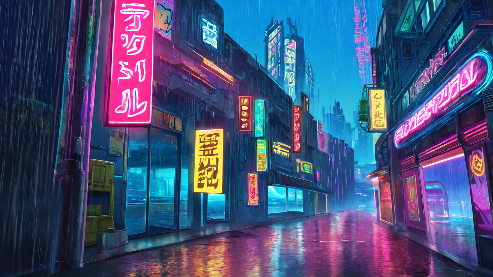
- Cyberpunk girl neon café — densely composed, full of small detail elements (neon signs, reflections, props on the table). Beautiful but visually busy; the eye keeps wanting to inspect.
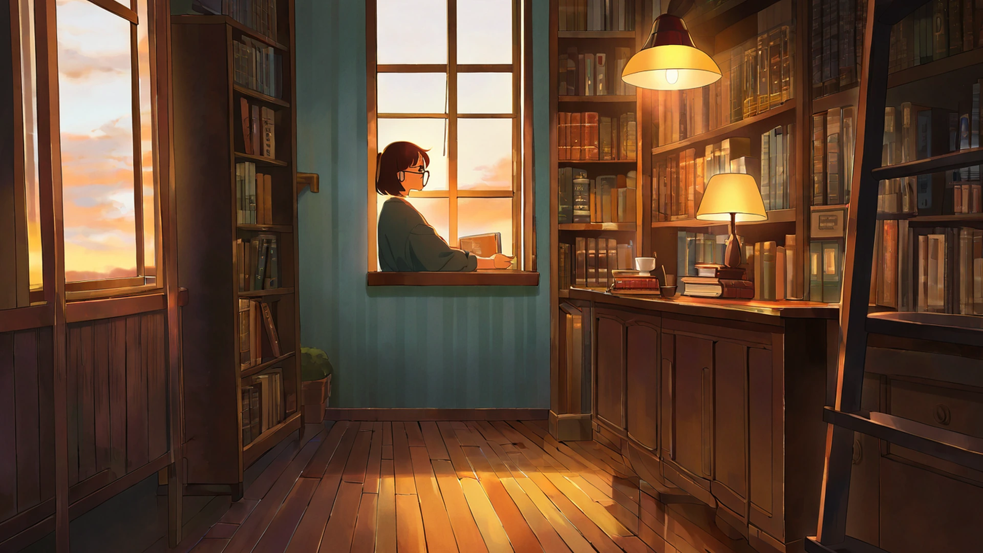
- Cozy bookshop interior — also densely composed; books, shelves, a desk lamp, layered objects everywhere.
These themes are not lower-quality. They serve a different function: they are paintings rather than wallpapers, in the sense that they reward attention rather than receding from it. They are the right pick for the days when you want your wallpaper to feel like a small gift; they are the wrong pick when you want it to feel like a calm wall.
Designing with ma in mind
For readers who generate or commission their own wallpapers (a growing number of people now), the practical principles for working with ma are surprisingly simple:
Default to leaving more empty than feels right. If you are not sure whether to add another element to the composition, do not. The composition almost always works better with less.
Anchor one or two focal subjects against negative space. A single tree against a vast sky. A small figure walking down an empty road. Two lanterns hanging from a wide dark frame. The contrast between subject and emptiness is what creates the visual interest.
Vary the texture of the negative space. Empty does not mean blank. The sky can have soft gradients, subtle clouds, a hint of stars; the snow can have gentle variations in tone; the mist can have tiny temperature shifts. Negative space with subtle texture reads richer than negative space that is mathematically flat.
Place the focal subject off-center. Centered subjects work for paintings; off-center subjects work for wallpapers. The off-center placement is what creates the asymmetric balance that lets the wallpaper coexist with windows and icons without fighting them.
Test at full screen, not in a thumbnail. A wallpaper that looks good as a 300px preview is not the same as a wallpaper that looks good covering a 4K monitor. Negative space, especially, only shows up properly at scale.
If you are using our gallery rather than generating your own, the simplest filter is: scan the thumbnail for areas that read as “nothing happening.” If you can identify a clear “nothing happening” region that takes up more than a third of the image, the composition probably has good ma. If the entire frame feels busy, the image is probably going to fatigue you over time, regardless of how beautiful it is in the moment.
The Japanese visual tradition has had eight or nine hundred years to work this out. The lessons translate cleanly to the smaller, more recent question of what a calming desktop background looks like, because the underlying problem — how to make an image rest the eye rather than work it — is exactly the same. — Lena