The first time wabi-sabi properly landed for me, I was sitting on the floor of a ceramics studio in Shigaraki, watching a potter named Tanabe-san pick up a bowl he’d just pulled from the kiln and set it on the “keep” shelf. I had been quietly hoping he’d keep a different one — glossy, clean, almost too symmetrical. He picked that one up next, looked at it for maybe three seconds, and dropped it into a wooden crate at his feet. The crate was for seconds, the rejects. I asked him why. He shrugged and said something I’ve been turning over in my head ever since: troppo facile da guardare. Too easy to look at.
I came back to Milan a different designer. I run a small studio off Via Tortona — brand identity mostly, some editorial, a handful of hospitality clients who want their hotel to feel like a place and not a Pinterest board. After Shigaraki I started saying no to the briefs I’d been quietly hating for years: the “perfect minimalist” ones where the client wants flat colour, hairline grids, every edge mathematically clean. I had been delivering those for almost a decade. They photograph well. They die on a wall.
Now when a client asks for “clean, minimal, Japanese-influenced,” I push back. They don’t want minimalism, which is a European invention dressed up in chopsticks. What they actually want, almost always, is wabi-sabi — and the two are not the same thing. This post is the long version of that pushback: five Japanese aesthetic ideas I now use as a working vocabulary, and why almost every lofi visual you’ve ever scrolled past is built on them whether the artist knew it or not.
Wabi-sabi (侘寂) — beauty in imperfection and impermanence
Wabi-sabi is the most internationally famous Japanese aesthetic and the most often mistranslated. Westerners reach for “shabby chic” or “rustic charm,” and both miss the point so badly I sometimes wonder if we should retire the English translation. The concept has two halves. Wabi (侘) started out meaning humble, the beauty of having less — historically a positive reframing of poverty, a way of saying simplicity was a virtue rather than a constraint. Sabi (寂) is the loneliness or sweet melancholy that comes with the passage of time: the patina on bronze, the moss creeping along an old garden wall, the slight asymmetry that emerges in a hand-thrown bowl after the maker accepts it instead of correcting it.
Together, wabi-sabi names the beauty of things that bear the marks of time and use, aren’t trying to be perfect, and are quietly on their way to fading. The canonical wabi-sabi object is a raku tea bowl — slightly off-round, glazed unevenly, sometimes with visible cracks repaired in gold lacquer (the related practice called kintsugi, where the repair becomes more valuable than the unbroken original). I keep a raku bowl on the windowsill above my drafting table. A friend gave it to me after a residency in Kyoto. It has a hairline crack near the rim and the inside shows two different colours of glaze where the kiln didn’t fire evenly. I’ve been offered a “better” one twice, by people trying to be kind. They don’t yet understand that this one is the better one.
In lofi visuals, wabi-sabi shows up everywhere once you have the eye for it — the worn wooden floor of a tatami room, a vinyl record with visible scratches across the sleeve, the faded ink of a hand-written note, the rain-streaked posts of an old engawa, the deliberate rumple of a character’s clothes. The simplest test I know is to ask: would this look better if it were cleaner, newer, more symmetrical? If the honest answer is no, the imperfection is the point — that’s wabi-sabi. If the answer is yes, but I couldn’t afford to fix it — that’s just shabby.
Mono no aware (物の哀れ) — the bittersweet awareness of impermanence
The phrase was coined by the 18th-century scholar Motoori Norinaga, and it translates loosely as “the pathos of things.” What it actually names is a very specific feeling — the gentle ache you feel when you realise something beautiful is also fleeting. The cherry blossom is the canonical example, and not because the flowers are spectacularly beautiful (they’re pretty, but a tulip is prettier). The point is that sakura bloom for about a week, and the entire culture has built a practice (hanami) around stopping work to go look while they’re there. The brevity is half the beauty.
I think about mono no aware a lot when I work with boutique hotels. There’s a temptation, when you’re branding a place, to design for the permanence of the building. I now design for the impermanence of the stay. A guest is there for two nights, three at most, and will never see the property in every season. The brand has to suggest that something specific is happening right now that they’re going to miss when they leave. That’s mono no aware as a working principle.
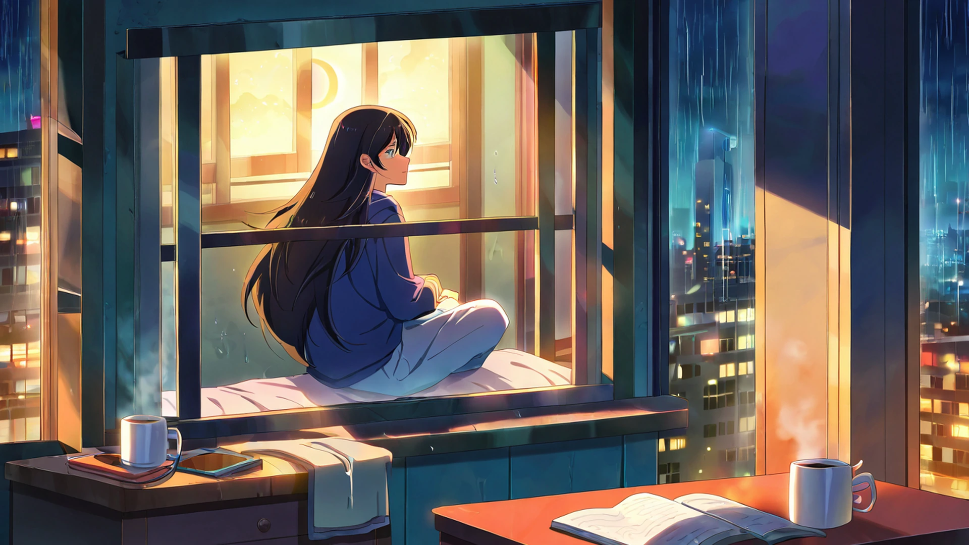
In lofi visuals you see the same instinct: sunsets and the blue hour, beautiful states that last minutes; falling leaves in an autumn village scene, mid-air, never settled; snow on a rooftop the audience knows will melt; steam rising from a cup that’s visibly cooling; the moments just after the rain has stopped but before everything has dried. It’s also why so much lofi animation uses long, slow camera moves and almost no cuts — the slowness is part of the message. A scene that races through changes can’t carry mono no aware. A scene that drifts can.
Ma (間) — the meaningful empty space
Ma is the hardest of these to translate and the one I quote most often to clients. It means “interval” or “gap” or “negative space,” but in a deeper sense it refers to the meaningful emptiness between things — the silence in a conversation, the unfilled space in a painting, the rest between two notes. Western design tends to fear empty space. I trained at IED Milano and then in London, and almost every design education I got treated white space as the leftover, the thing you got when you ran out of content. Japanese design treats it as the active element. A single teacup on a large empty table is more powerful than ten teacups crowded together, because the emptiness around it is doing visible work.
I run an exercise with junior designers when they join the studio. I ask them to lay out an editorial spread, then I cover three-quarters of the composition with a sheet of paper and ask which of the remaining quarters they can still defend. Usually one corner turns out to be load-bearing and the rest is decoration the eye skipped over. Ma is the discipline of designing as if every quarter has to defend itself.
In lofi visuals ma shows up as the empty desk with one notebook and one pen; the lone tree against a soft sky in an autumn village; the empty engawa with a single cushion and a single teacup; the fog or low contrast that creates deliberate emptiness in the background. It shows up in the lofi music too — the pause between drum hits, the breath of silence before the loop resets. The reliable cue is that an image is using ma when it has less in it than you’d expect but somehow feels complete. This is also why a careful minimalist desk feels so much calmer than a stylish one. A clear surface with one or two objects lets the mind rest in a way that a “curated” desk full of “essentials” never can.
Yūgen (幽玄) — profound mystery beyond what’s visible
Yūgen is the sense of deep, quiet mystery — looking at distant mountains disappearing into mist, a moonlit garden, a single lantern visible across a fogged-in bridge, and knowing intuitively there is more there than you can see. A direct translation might be “subtle profundity.” The principle is that the suggestion of something is often more powerful than its full revelation, and Japanese Noh theatre is built around it — emotion conveyed through stillness and minimal gesture rather than explicit display. A single tilt of the head can carry a soliloquy.
I have a small print on the wall of my studio I bought at a flea market in Kanazawa: a brush-and-ink landscape, maybe ten centimetres across, showing a single pine tree on the left, a wash of fog in the middle, and on the right edge, half-disappearing, what might be a roof or might just be a shadow. I have stared at that print for years and still don’t know whether the right-hand mark is a building. That uncertainty is the whole experience. If the painter had committed to a roof I’d have stopped looking after a week.
In lofi visuals, yūgen is the misty mountain in the distance of a snowy village scene, the path leading out of frame with the destination unclear, the lantern lighting only a small area while the rest stays in soft shadow, the character seen from behind with her face implied but not shown, the doorway open to an interior the viewer never enters. Yūgen is the reason a good lofi scene feels like part of a larger story you don’t quite see. The frame shows a small slice; the rest is suggested; and you, the viewer, are invited to imagine.
Shibui (渋い) — restrained, mature beauty
Shibui describes a beauty that is subtle, unobtrusive, and quietly self-confident — the opposite of flashy. A shibui object doesn’t try to impress you on first glance; it rewards you for paying close attention over a long time. Picture two ceramic bowls. The first is brightly coloured with a complex glazed pattern. The second is matte grey, hand-thrown, with subtle texture variations only visible when you turn it in your hands. The first is kirei — pretty. The second is shibui. They are not on the same scale.
I had a long argument once with a fashion client about a packaging redesign. They wanted the box to scream. I designed it to whisper. We eventually landed on a matte uncoated stock, a deboss for the logo that caught light only at certain angles, and a single thread of saturated colour on the inside lid you only saw after opening. Six months later they told me the box was the most-photographed thing in their unboxing videos. Customers were filming the moment they discovered the inside thread. That is shibui working — the restraint creates the reward.
In lofi visuals, shibui shows up as the muted palette of earth tones and soft pastels that never tips into neon, the aged-paper texture in backgrounds, hand-drawn linework that doesn’t try to look digitally perfect, the single warm light source instead of even bright lighting, the emphasis on natural materials like wood, paper, ceramic, fabric over plastic or chrome. The strongest visual rule of lofi is that nothing in the frame competes for attention. Saturated colours, sharp edges, visual chaos all violate shibui. The goal is something you can leave on a second monitor for hours and feel calmer for it.
How these concepts compound
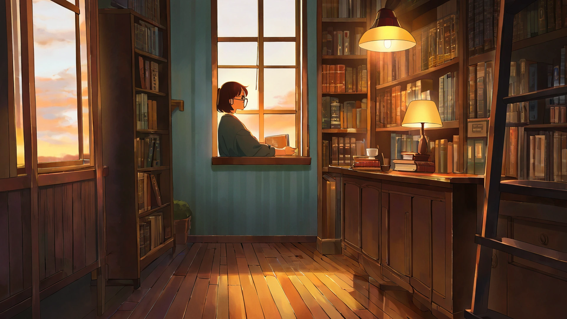
Notice that these ideas keep folding into each other. An old engawa with most of the surface empty and a single object on it is wabi-sabi and ma at once. Cherry blossoms in fog, drifting somewhere you can’t see, is mono no aware fused with yūgen. A muted-colour desk with one object and a lot of breathing room is shibui plus ma. A misty path leading to a weathered torii gate is wabi-sabi and yūgen at the same time. The classic lofi visual — a girl studying by a rainy window, with a cup of tea, a cat, and warm lamp light — is actually all five at once: wabi-sabi in the worn, lived-in space; mono no aware in the rain that will stop; ma in the empty air around her; yūgen in the night outside; shibui in the muted palette where nothing competes.
This is why lofi visuals feel so consistent across thousands of artists working independently. They aren’t copying each other. They’re drawing, often unconsciously, from the same vocabulary — older and more disciplined than the genre wearing it now.
How to apply these in your own space
If you work at a desk and want to bring these principles into your space, here’s the version I give to students and to friends redoing a home office. For wabi-sabi, allow some imperfection — a ceramic mug with a crackled glaze, a wooden surface with visible grain, paper notebooks instead of perfect digital interfaces. Don’t replace things just because they show wear; that wear is the design speaking. For mono no aware, include something seasonal: a small vase with one stem in season, swapped as the year turns. The fact that it’s temporary is part of its function. For ma, reduce clutter; the most powerful change you can make to a study desk is removing things rather than adding them, and trusting that the empty space around your laptop is doing as much aesthetic work as the laptop is. For yūgen, build in a sense of depth — a small lamp instead of overhead lighting so the corners stay slightly dim, a window or mirror suggesting space beyond, a bookshelf with partially visible spines hinting at a larger collection. For shibui, hold a muted palette: wooden tones, soft greys, off-whites, earthy greens; never pure white (too clinical) or saturated colours (too demanding); a single warm light source around 2700-3000K rather than cool overhead light.
For more practical desk-setup advice, our cozy desk setup guide covers the physical implementation in detail.
Why this matters for studying
These aesthetic concepts aren’t just decoration. Each maps onto a specific cognitive effect, and I’d argue that’s why they have lasted as long as they have. Wabi-sabi reduces the pressure to perfect a workspace before starting — one of the most common forms of procrastination I see in students, the desk has to be Instagram-clean before they can begin, and wabi-sabi quietly tells them lived-in is okay. Mono no aware invites presence rather than rush; studying is a temporary act inside a temporary day, and treating it that way makes the act feel less like a sentence. Ma reduces visual cognitive load — less to process in your peripheral vision means more attention available for the task. Yūgen creates a sense of “more to discover,” which supports the low-grade curiosity that makes long study sessions sustainable. Shibui keeps the environment from competing with your work for attention, which is the whole point.
Study spaces designed around these principles feel calmer than spaces designed to be stylish or Instagram-ready. The Japanese aesthetic tradition has been optimising for sustained, quiet attention for over a millennium, and a great deal of modern productivity advice is, in practice, just rediscovering what zen monks and tea masters figured out centuries ago.
The visuals themselves
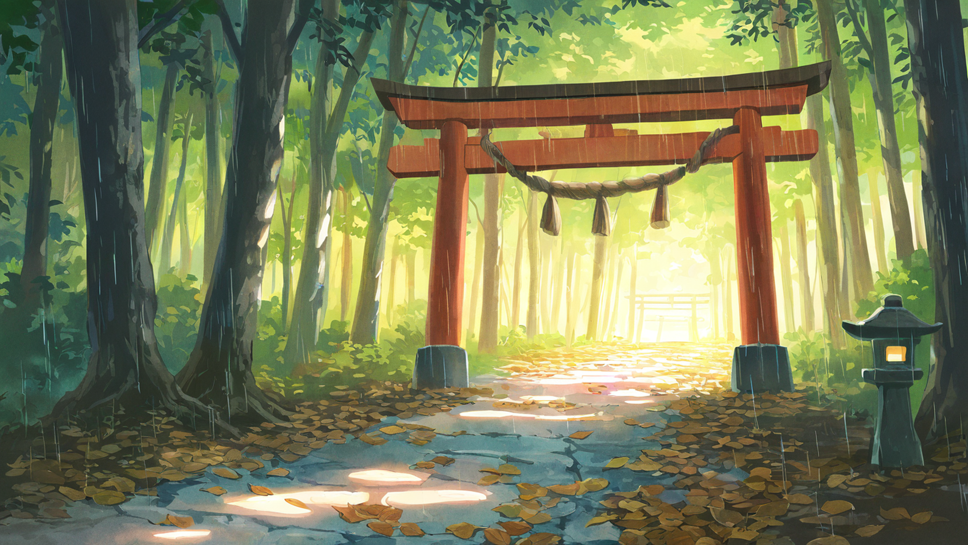
Our aesthetic wallpaper gallery draws from all five concepts deliberately. The palettes are muted (shibui), the compositions leave breathing room (ma), many of the scenes show seasonal moments — cherry blossoms, autumn leaves, falling snow — which are explicitly mono no aware, and the recurring motifs of torii gates, misty mountains, and lantern-lit paths are deeply yūgen.
If you want to see it in action, the cherry blossom wallpapers are the most explicit mono no aware in the collection; the snowy mountain village scenes are where yūgen and distance live; the shrine torii pieces are where ma and shibui meet; and the rainy porch (engawa) frames are wabi-sabi and ma working together. Or set the tone for an entire session by opening our 24/7 lofi radio — the music is built on the same principles, just translated from image into sound.
The deeper you look at lofi, the more you find that it is, visually, just Japanese aesthetic refined for the screen. The sound borrows from American jazz and hip hop; the look borrows from a thousand years of Kyoto tea masters, Edo-period painters, and Studio Ghibli’s animators carrying that tradition forward. It’s old in a way most internet aesthetics never get to be. And for a designer trained in the European tradition, working from a studio in Milan, that depth is a relief — there is, finally, a vocabulary for what I wanted to make all along.