The first time cherry blossoms ruined me as a designer was during a residency in Tokyo, back when I still thought I understood pink. I had taken a month away from my studio off Via Tortona — a small ground-floor space in Milan I share with two other designers, the kind of room where you bump elbows whenever someone uncaps a Pantone fan — and I had gone to Japan with a vague plan to study type and packaging and instead spent half my afternoons sitting under sakura trees in Ueno Park taking photos I did not need. The photos were almost identical. Tree, sky, petals. Tree, sky, petals. What I was actually doing, I realised later, was trying to learn the colour by sitting inside it long enough to forget what I thought it was.
I came home with a hard drive full of those photos and an opinion about sakura that I have not been able to shake since. Italian designers, in my experience, abuse this palette. Every spring there is a fresh wave of campaigns from Milanese fashion houses, from luxury brands, from boutique cafés near Brera, that go after la primavera giapponese with the same heavy hand: hot magenta, glossy gradients, three petals floating in front of an over-saturated blue. It looks like a photo filter, not a flower. The actual sakura petal in afternoon light is barely pink at all — closer to a warm white with a blush of coral at the base — and the surrounding tonality matters more than the petal itself. When my Italian peers reach for sakura, they reach for the cliché version, the one you would find on a packet of green-tea KitKats at duty-free. Il rosa becomes a costume.
So when this site asked me to write a curatorial guide to cherry blossom wallpapers, I said yes immediately, and then sat in front of the laptop for an hour trying to write it without sounding like every other “Japanese spring aesthetic” listicle on the internet. What follows is not a list of categories. It is what I would tell una cliente who walked into my studio asking for sakura references that did not feel cheap. The wallpapers we make on this site happen to align unusually well with the way I think about this palette professionally — restrained, tonal, aware of branch and sky as much as flower — and the picks below are organised the way I would organise them on my own mood board, not the way an SEO outline would dictate.
Why this palette is harder to use well than designers admit
Beyond the obvious fact that pink flowers are pretty, sakura imagery does something specific to the eye that I think most designers underestimate. The composition is almost always built in three tiers of depth: pink petals in the foreground, dark branches in the mid-range, and a cool sky behind. That layered depth is the reason the image reads as restful instead of busy, even when the canopy is packed with blossom. Strip out the dark branch structure and the picture collapses into a flat pink wash, which is exactly what happens in those bad Milanese campaigns I keep complaining about — somebody decided the branches looked too austere and brightened them, and the whole thing lost its skeleton.
The warm-cool tension matters just as much. The pink lives in the warm half of the wheel, the sky in the cool half, and the eye reads the contrast as freshness without needing to be told. When I tone a brand palette for a client whose brief asks for “Japanese spring”, I usually argue for keeping the pink anchored to a single hue with low saturation and letting a desaturated periwinkle or a slate-grey sky carry the rest. The temptation is to push the pink up; the discipline is to pull everything else down. The same logic governs the wallpapers I have been picking for my own desktop this season.
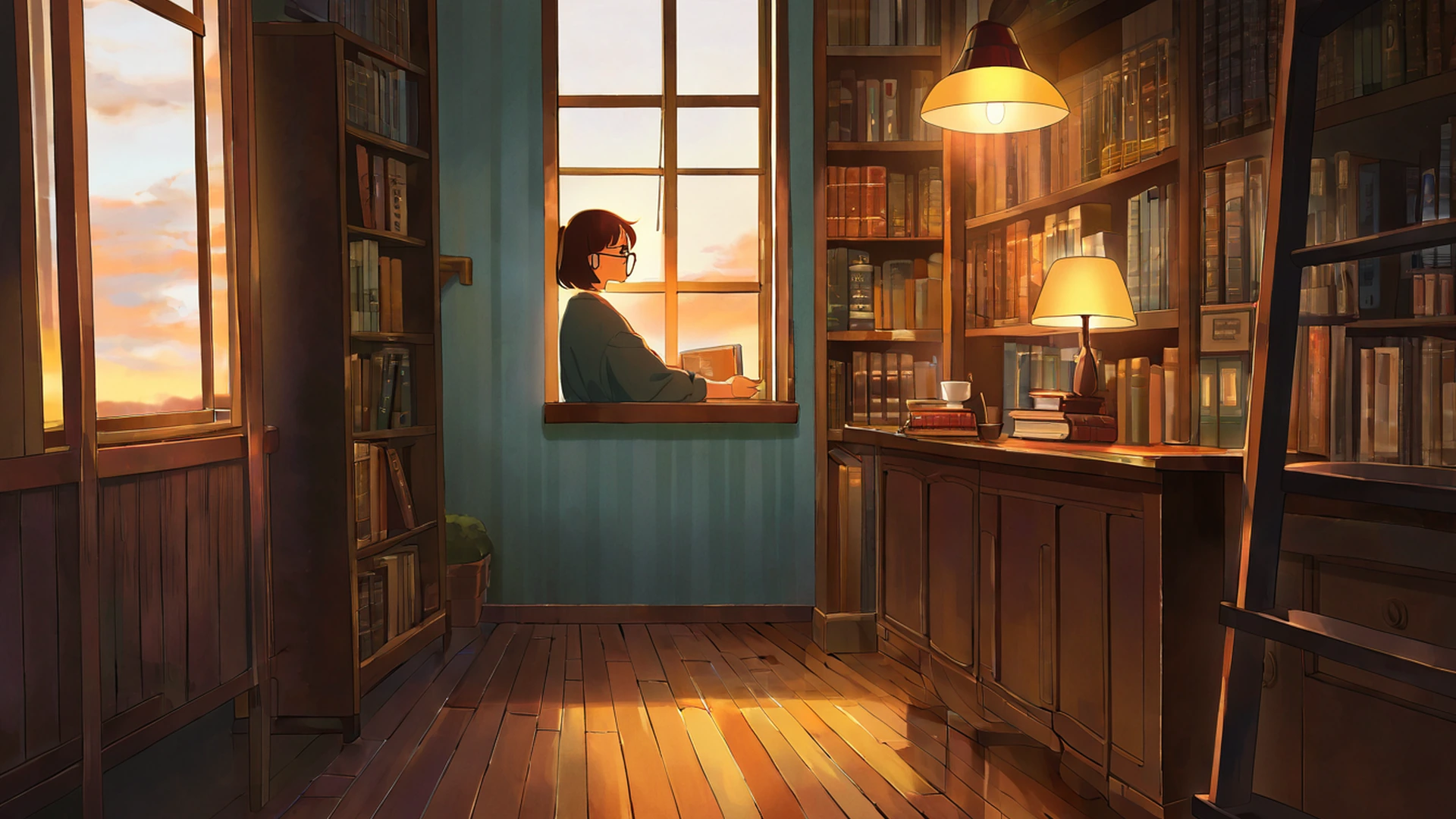
And there is mono no aware, the famous “gentle sadness of impermanence” that any article about sakura is contractually obliged to mention. I am wary of using the term because it has been repeated into mush by people who have not earned it, but the emotional register is real. The petals fall. The image carries the knowledge of the falling. The viewer absorbs it whether they can articulate it or not. I think this is why a sakura wallpaper, used during quiet focused work, settles me in a way that a cyberpunk neon scene never could. There is a softness in the attention it invites — a slowness. For deep reading or careful design work, I find I default to sakura on my screens for the entire month of April, and I have stopped pretending this is a coincidence.
What I have on my own desktop right now
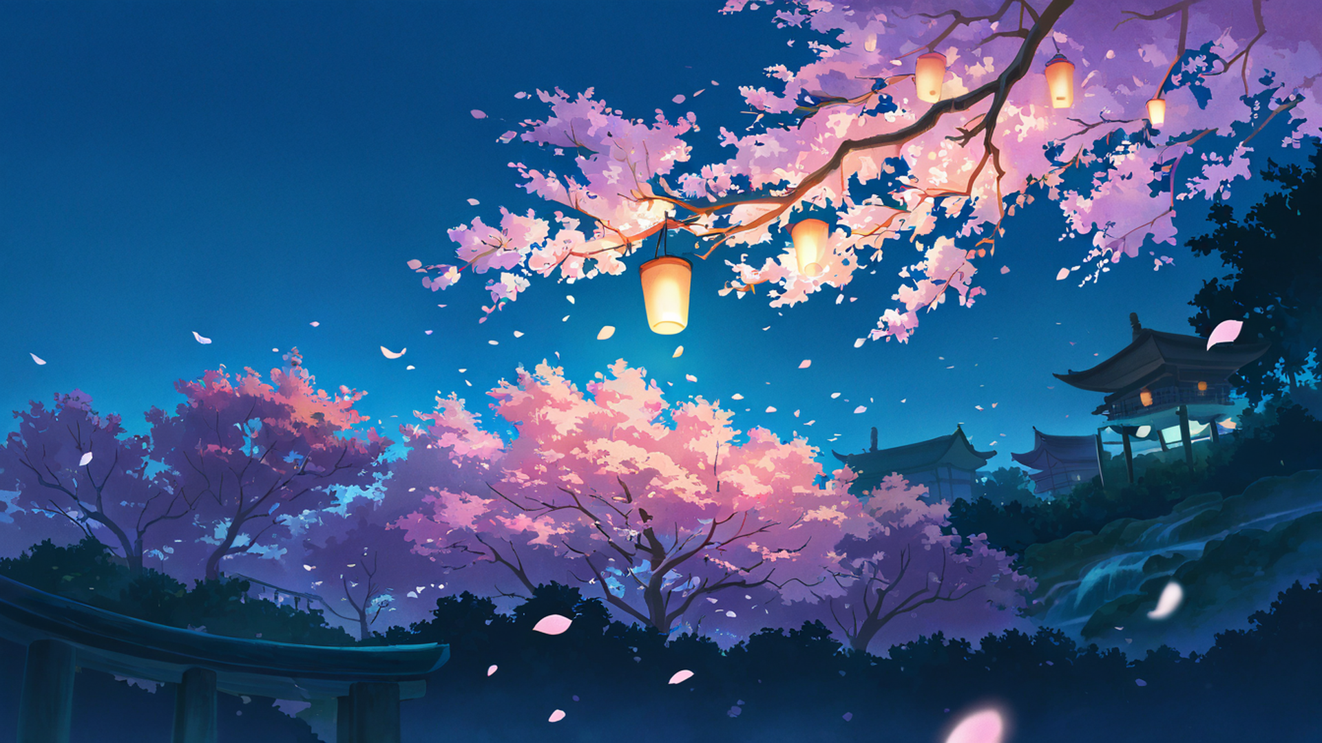
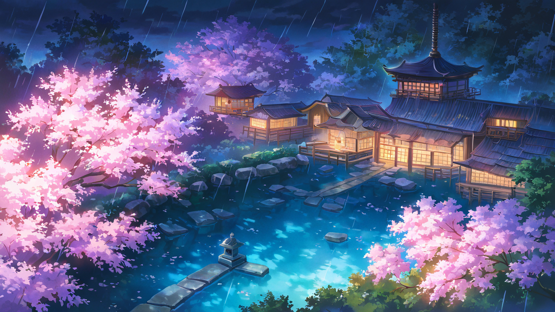
The wallpaper I have been using all of la primavera this year is from the path scene with stone lanterns — a curving walking path lined with sakura leading toward a small shrine in the background. It is one of the more architecturally legible pieces in the collection: you can trace the path with your eye, the lanterns give the composition a rhythm, and the dark branches keep the pink anchored. I have it at 5120×2160 on the ultrawide in the studio, and at 1290×2796 on the phone in my pocket. I do not normally believe in matching wallpapers across devices but with this scene the consistency lands as deliberate rather than fussy.
If you are looking for the desktop versions, they live in the full Cherry Blossom Path desktop collection and every image page offers the resolution you actually need: 1920×1080 for plain Full HD, 2560×1440 for QHD, 3840×2160 for 4K, the two common ultrawide ratios at 3440×1440 and 5120×2160, the Samsung Odyssey G9 super-ultrawide at 5120×1440, and the rare triple-monitor 48:9 sizes that always feel slightly absurd to me when I see them in pixel count. I have a designer friend in Berlin who runs three Eizos in a horizontal strip and I once watched her set a sakura panorama across the whole rig; the petals scrolled past her like a stage flat. It was, against my expectations, beautiful.
There are three other scenes from this set I keep returning to in client mood boards. The blossoms-and-wooden-bridge composition has a quiet diagonal that I find useful as a contrast piece — the bridge cuts across the frame, petals sit on the water, and the negative space at the top makes it forgiving for overlay text if you happen to be using it as a presentation slide. The lone-sakura-tree-in-a-field piece is the minimalist option, almost editorial in its restraint, and I have used a similar composition in a real cosmetic brand brief to argue against decorative clutter. The temple-courtyard piece I save for when I want architecture and bloom in the same frame; the eaves of the roofline echo the canopy shapes in a way that feels intentional rather than accidental.
On phone, the portrait set matters more than people realise
This site generates a separate portrait pool in native 2:3, and I want to be clear that this is not a small thing. Most wallpaper sites give you a horizontal image cropped down to vertical, which sounds fine until you actually try it: you lose about 56% of the width, and any composition element placed deliberately at the left or right of the frame disappears entirely. A bridge that was the visual anchor in the 16:9 version becomes a vague suggestion of woodwork. The native 2:3 versions here were re-composed from scratch, which is the only honest way to do it.
The portrait files cover the resolutions I actually care about. There is a 1290×2796 version for the iPhone Pro Max, a 1179×2556 for the standard Pro, a 1080×2400 for most modern Android handsets, and an iPad Pro pair at 2048×2732 and 1620×2160 that I keep on my own tablet for sketching breaks. There is also a 1000×1500 version sized specifically for Pinterest, which I will come back to in a second because Pinterest deserves its own paragraph. You can pull all of these from the Cherry Blossom Path portraits collection and the resolution picker on each wallpaper page is where the right size lives.
The Pinterest question is small but unexpectedly important. I curate a board called referenze primaverili — spring references — that I keep up for myself and for the studio, and I have noticed that Pinterest aggressively favours vertical content in its feed. The 2:3 image at 1000×1500 ranks higher and crops better than a 16:9 image squeezed into the same slot. Every wallpaper page on this site has a dedicated Pinterest button that hands you the file at that exact resolution, no manual resizing required. I have stopped saving the 16:9 versions to my Pinterest boards entirely.
How to actually set one
I will keep this short because it is mostly muscle memory once you have done it, but for anyone who has not: on iPhone you save the file to Photos with a tap-and-hold, then Settings → Wallpaper → Add New Wallpaper → Photos, and you adjust position before confirming. On Android you download to Gallery, open the image, three-dot menu, Set as → Wallpaper, then pick Home, Lock, or both. On Windows or macOS you download the 4K or Full HD version depending on what your display can actually resolve and right-click to Set as Background on Windows, or drag the file into Desktop & Screen Saver on macOS. On Pinterest you click the Pinterest 2:3 download button on the wallpaper page and either use the browser extension or right-click Save As before uploading to your board. None of this is interesting. All of it works.
The ambient layer
If you happen to be using one of these wallpapers while working, the audio mixer on the homepage layers ambient channels over the live lofi stream and I have an opinion here too. The combination I keep coming back to with sakura imagery is the rain channel at roughly thirty percent, low enough that you forget it is playing, high enough that the room shifts. Rainy sakura is a recurring motif in Japanese visual culture for a reason — the wet petal against the dark branch reads as even more contemplative than the dry version — and the sound reinforces what the image is already saying. You can start the stream with ambient sounds from the homepage and adjust the channels from there.
A designer I have been studying
I want to mention Ikko Tanaka because I have been thinking about his work a lot this spring. Tanaka, the post-war Japanese graphic designer who built the visual identity for Issey Miyake among many other things, had an extraordinary ear for how Japanese visual tradition could be re-staged in modern composition without becoming pastiche. His posters used flat colour and aggressive geometry, never reaching for the obvious sakura petal, and yet the work feels unmistakably tied to Japanese aesthetic sensibility. I keep his monograph on the shelf above my desk and I look at it whenever a client brief asks for “Japanese spring” and I feel myself tempted to reach for the easy pink. The lesson I take from Tanaka is that the discipline of the palette matters more than the literal motif. You can evoke sakura without ever drawing a petal. You can also draw a petal badly and evoke nothing.
The wallpapers in this collection earn their petals, in my opinion, by surrounding them with everything else that the cliché versions usually omit — branch structure, atmospheric perspective, the cool sky, the suggestion of a wooden roofline or a stone path. The pink is there. The pink is not doing all the work.
Related themes for the rest of the year
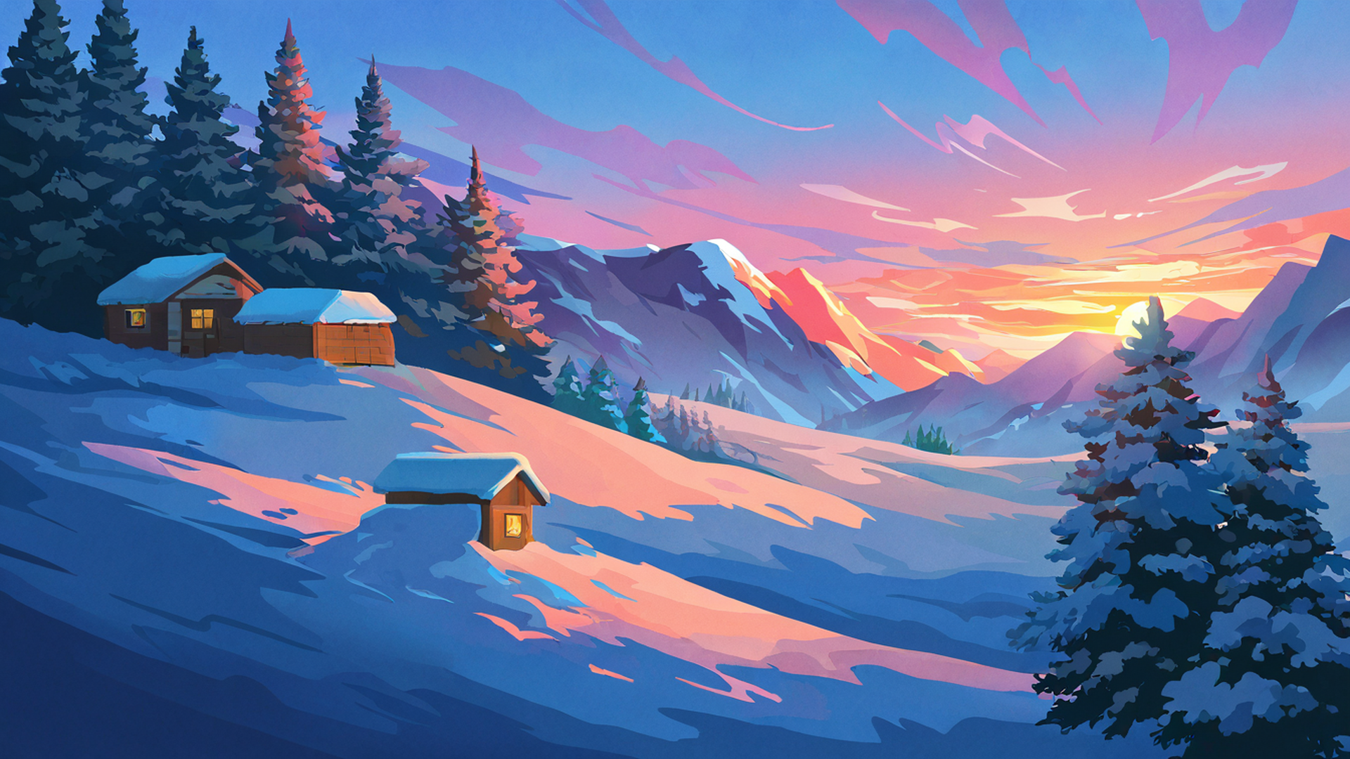
If you have made it this far and the sakura register is what you are after, the closest neighbours in our collection are the autumn maple village, which carries the same melancholic warmth and the same high-contrast architecture-against-canopy logic; the rainy porch engawa scenes, which keep the introspective mood but trade spring for the deep wet of June; the lantern festival night images, which are still recognisably Japanese in their aesthetic vocabulary but lit by paper lanterns instead of afternoon sun; and the snowy mountain village set, which I think of as the winter cousin of sakura, the same mono no aware in a different season. You can find each at autumn maple village, rainy porch engawa, lantern festival night, and snowy mountain village. I have written separately about the Japanese seasonal cycle and why your aesthetic should change with it, and the short version of that argument is that rotating themes with the actual outdoor season — sakura in early April, fresh greens in May, blue rain in June, fireworks in late summer — gives you a small but real anchor against the otherwise undifferentiated stretch of digital time most of us live inside.
For now though, it is la primavera. The petals fall every year regardless of what we choose to do with our wallpapers, and I would rather spend April looking at the version of sakura that does the palette justice than the over-saturated version that does not. The picks above are mine. The collection is free, both landscape and portrait, no account required.