I spent the better part of my doctoral years staring at a dark screen. VS Code with a charcoal theme, terminal windows in muted greens and grays, the whole aesthetic of someone who meant serious business — or at least wanted to look the part. My office in the department building had a single window that faced a concrete wall, so by mid-afternoon the room was dim enough that the dark interface felt genuinely comfortable. I assumed I had figured something out that other people hadn’t. Then I started getting persistent eye fatigue around month eighteen, and I made the mistake that I suspect most of us make: I blamed the nearest variable.
I was certain it was the screen. Specifically, I was certain it was the light mode spreadsheets I had to open for data cleaning in between coding sessions — the sudden white rectangles in an otherwise dark setup felt blinding, and I told myself the contrast was destroying my eyes. A colleague in the bioinformatics group, who had been working in front of screens for a decade longer than me, listened to my theory patiently and then said something that genuinely unsettled me: “It’s probably your room, not your mode.” She pointed out that my monitor was calibrated to a typical brightness of around 200 nits while the rest of my workspace was radiating nearly nothing. The contrast between the lit display and the dark surround was the real problem. I had been diagnosing the wrong variable for eighteen months.
That conversation sent me down a rabbit hole of reading about display ergonomics that I probably enjoyed more than I should have. What I found complicated my assumptions considerably — and eventually convinced me to change not just my setup but my confident opinions about what dark mode was actually doing for me.
What the research actually shows about reading
The most reliable finding in the display ergonomics literature is also the one that dark mode enthusiasts find most inconvenient: for reading ordinary text, a dark background is measurably worse for most people. The Nielsen Norman Group published research in 2020 that confirmed what earlier work had been suggesting — reading speed on light mode interfaces runs roughly five to ten percent faster than on dark mode for the majority of readers, and comprehension is either equivalent or slightly better on the lighter background. This isn’t a huge effect, but it’s real, it’s consistent across multiple studies, and it gets larger when you extend the reading session.
The mechanism is actually quite interesting. When you look at a dark background, your pupils dilate to compensate for the lower overall luminance. A larger pupil is physically less precise — it introduces more optical aberrations, the same way a camera lens at maximum aperture produces softer edges than at a mid-range f-stop. So light text on a dark background is literally reaching your retina through a wider, less sharp optical opening. For many people this creates a subtle halation effect, a soft glow or halo around individual letterforms that makes reading effortful in a way that’s hard to articulate but very real. People with astigmatism — which is roughly thirty percent of the population — report this effect more strongly, because astigmatism itself creates directional distortions that the pupil dilation compounds.
I didn’t fully accept this when I first read it. My experience in the dim office felt like evidence against the claim: dark mode was obviously more comfortable for my eyes. But my colleague’s insight had planted a seed of doubt, and I gradually started testing the assumption. I began opening my dissertation drafts — thousands of words of prose that I had to read, edit, and restructure over and over — in a light document view. At first I found it uncomfortable, the way any change to a habituated environment feels wrong. After a few weeks I had to admit it was faster. Not dramatically faster, but I was catching more errors on the first pass, holding more context, finishing editing sessions with less of that particular exhaustion that comes from sustained reading rather than sustained thinking.
The case for dark mode is real, just narrower than people claim
This is not a simple “light mode wins” argument, and I want to be honest about where dark mode genuinely earns its reputation. Code editing is the clearest case. Syntax highlighting — the practice of coloring different language constructs differently — achieves much better visual separation on a dark background than on white. Keywords in purple, string literals in amber, comments in faded gray: these distinctions read clearly against a dark base in a way they don’t against bright white, where the colors wash out into the general luminance. I still write code in a dark editor. My switch to light mode was specifically for prose, and it took me several months to fully admit it because I found the concession somewhat embarrassing.
Dark mode also makes genuine sense when the ambient environment is dark. This is the real variable my colleague was identifying — not dark mode versus light mode in the abstract, but the relationship between the screen and the surrounding space. A bright white interface in a dark room creates a harsh differential between the lit rectangle and everything else your peripheral vision registers. Your eyes are constantly re-adapting as they move between the screen and the room, and that repeated adjustment is what produces fatigue. A dark interface in a dark room reduces that differential dramatically. This is why watching films in a darkened cinema feels comfortable even over two hours, while working at a bright laptop in a dim bedroom feels punishing after forty minutes — the film screen has a dark surround (the black bars, the dark scenes), while the laptop is a rectangle of concentrated luminance in a field of near-zero.
There’s also the glare problem. A light-colored interface reflects ambient light back at you from above or behind, and depending on your room and monitor position, this can be substantial. I had a period during the writing-up phase when I was working at a café that had enormous windows and a glass roof, and in the late mornings the reflections on my screen were genuinely distracting in light mode. Dark mode effectively hides glare because the screen surface is already dark — the reflections blend into the interface rather than competing with it.
The identity politics of dark mode
Here is the part where I want to be honest about something I find genuinely amusing. A significant fraction of dark mode preference among developers — and I spent enough time in that community to have watched this closely — is not about ergonomics at all. It’s about identity. Dark mode has become a signal: I work on serious software, I live in the terminal, I am not a casual user. It is the visual equivalent of using a mechanical keyboard with blank keycaps or typing exclusively in lowercase. The aesthetic communicates “I have moved past the defaults.”
I find this charming rather than contemptible, because I was absolutely part of it. My dark theme was not chosen by researching pupil dilation effects. It was chosen because it looked like what a researcher who took their tools seriously would use. And honestly, that’s not nothing — if your visual environment creates the right psychological context for deep work, the effect on your output is real even if the mechanism is social rather than physiological. I sat down to my dark-themed VS Code and felt like I was doing real work. That feeling matters. But it’s worth being clear about what you’re optimizing for. When the dark interface is helping you enter a focused state, it’s doing something useful. When it’s making your reading slower and you’re pretending that doesn’t apply to you because reading isn’t your “real” work, you’re paying an unnecessary cost for an aesthetic.
How room lighting changes everything
My colleague’s observation turned out to be the most actionable thing anyone told me during four years of doing this. The lighting in your physical space is a larger lever than your interface mode choice, and most people have much more control over it than they realize.
The problematic configuration I had been living in — dim room, bright screen — is probably the most common setup for anyone who works in the evening. The fix isn’t complicated. You can add a bias light behind your monitor (a strip of warm LEDs along the back edge) which raises the ambient luminance near the screen and reduces the differential. You can keep an overhead light or a desk lamp on while working. You can choose a screen brightness that matches the room rather than maximizing it. My own setup now involves a desk lamp with a warm bulb that I keep on regardless of time of day, and I’ve found that this single change does more for end-of-day eye comfort than any interface theme decision.
The 20-20-20 rule — every twenty minutes, look at something twenty feet away for twenty seconds — is another intervention that I’ve consistently found more effective than interface tweaks. The fatigue I was attributing to light mode was largely accommodation fatigue: the muscles in the eye that adjust focal length for close work. They don’t care what color the background is; they care that they haven’t relaxed in three hours. I set a timer on my phone during long writing sessions and started following the rule religiously during the final year of my thesis, and the difference in how I felt at the end of the day was more noticeable than any theme change had been.
Evening work and blue light
There is one genuinely important asymmetry between dark and light mode that doesn’t get enough attention in the usual ergonomics discussions, which tend to focus on reading speed and eye strain. Light mode emits substantially more blue-wavelength light, and blue light in the evening suppresses melatonin production and delays sleep onset. If you’re doing serious reading or writing late into the night, a bright white screen is actively working against your ability to recover properly.
This doesn’t mean dark mode is the only solution. Blue-light filtering software — f.lux, macOS Night Shift, Windows Night Light — warms the color temperature of the entire display starting at sunset, reducing the blue component while keeping the light-mode layout intact. I use Night Shift on my Mac with a relatively warm setting from around seven in the evening, and I keep a light interface for reading and writing right up until I close the machine. The relevant variable for sleep disruption is the spectral content of the light, not the background color per se, and filters address that directly.
That said, if you’re working in a genuinely dark room at midnight, combining dark mode with a blue-light filter is probably the highest-comfort configuration. I do this for the occasional late session when I’m editing something that requires sustained attention — dark theme in the editor, f.lux running warm, the lamp behind the monitor providing enough ambient light to prevent the harsh screen-room differential.
Thinking about specific tools
The honest answer to “which mode should I use” is that it depends on what you’re doing, and most people’s workflows contain several different task types that might reasonably call for different settings.
For anything where I’m reading dense prose — journal articles, book chapters, my own drafts — my preference for light mode has become settled and I no longer question it. My comprehension is genuinely better and editing sessions feel less exhausting. For code, I stay with dark mode not because I’ve convinced myself the research is wrong but because the practical advantage of syntax highlighting on a dark background is real and the reading-speed penalty doesn’t apply the same way to scanning code as it does to linear prose. Web browsing I’ve set to follow the system setting, which on my machine switches to dark at sunset automatically. For email and document editing, light during the day.
Photo editing and other color-sensitive work is its own territory. The industry standard is dark mode because it reduces how much the bright UI interferes with your perception of the image, which is the actual focus of attention. I do occasional work with images and I follow that standard without much deliberation.
The thing I’d push back on is the idea that you need to make a single global choice. Most operating systems and most applications support automatic switching, and the friction of maintaining different modes in different contexts is basically zero once you’ve set it up. What helped me was stopping thinking about it as a preference statement about who I am — the developer aesthetic, the light mode normie, whatever — and starting to think about it as a contextual tool. Code open: dark. Draft open: light. Evening falling: warm filter on, maybe dark. That’s it.
On wallpapers and the visual surround
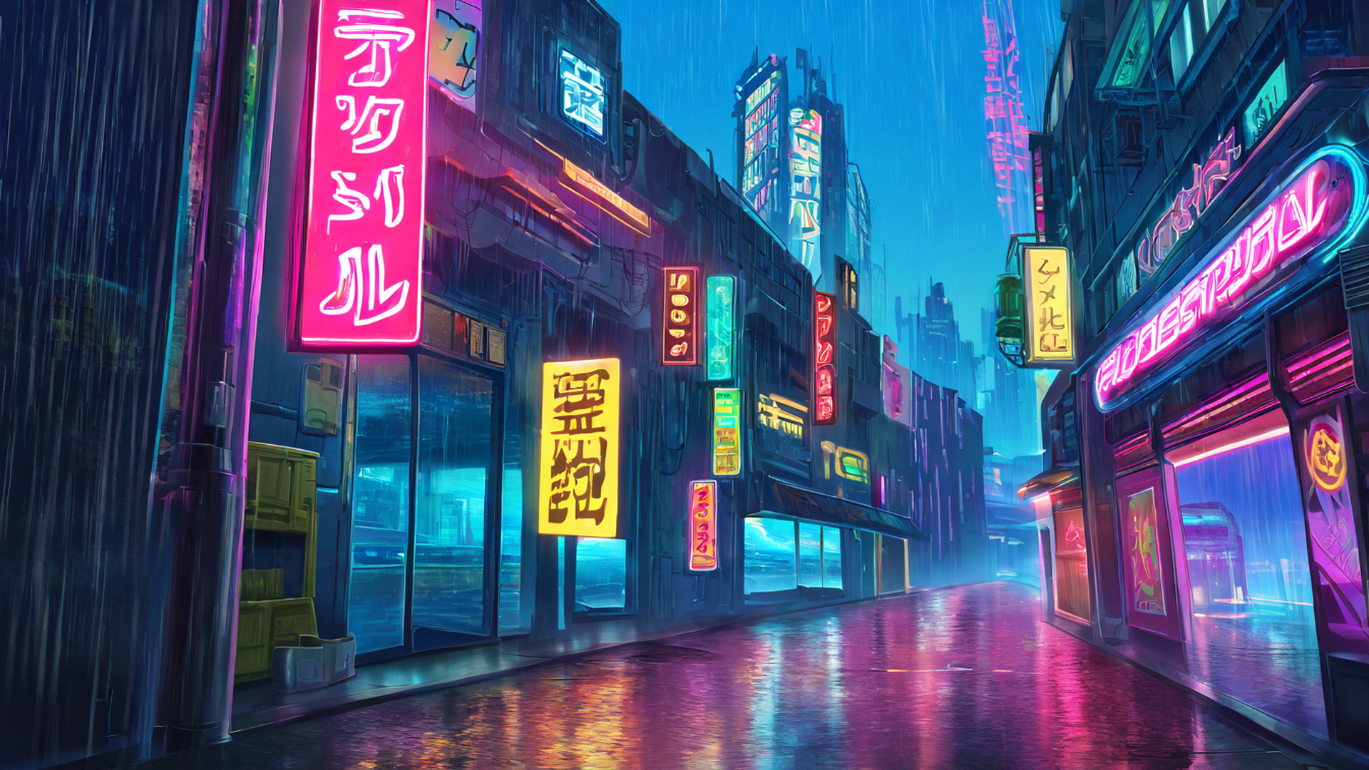
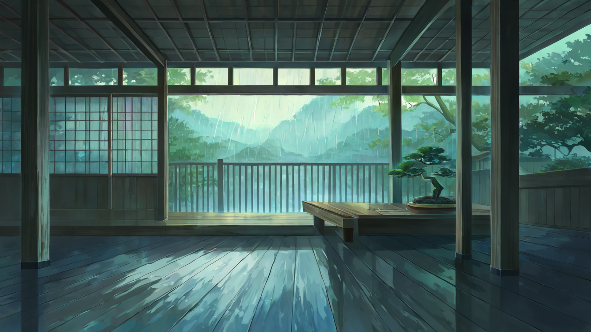
Since I spend time thinking about how visual environments affect work quality, I’ve also developed opinions about desktop wallpapers along the same lines. A high-contrast, highly detailed wallpaper behind your application windows creates low-level attentional drag — your visual system keeps registering things at the edges of your workspace that aren’t the task. Muted, low-saturation images that provide a calm background texture without demanding attention are meaningfully different in this regard. I’ve spent enough time in both configurations to be confident this matters for sustained sessions, even if the effect is subtle on any given day.
The Japanese aesthetic principles that I’ve written about elsewhere on this site apply directly here: spaces with visual calm, where nothing insists on being noticed, create a different working quality than visually busy environments. My wallpaper rotation skews toward those principles. Soft gradients, misty landscapes, architectural interiors with subdued palettes. Nothing that competes with the actual work.
What I’d tell my second-year self
The honest summary of what took me too long to learn: dark mode is not a productivity hack, it’s a context-appropriate tool that happens to have an outsized aesthetic identity attached to it in certain communities. Reading, including reading your own writing, is faster and less fatiguing in light mode for most people, and I am one of those people. Code and other syntax-highlighted work genuinely benefits from dark mode. The room around the screen matters more than the screen’s color scheme. Evening work should involve warmer light regardless of interface mode.
I still have a certain fondness for the dark theme aesthetic — I understand why it signals what it signals, and I don’t think less of people who use it across the board for identity reasons as much as ergonomic ones. But the months I spent in light mode for prose before fully admitting it was better were months of slower editing and unnecessary fatigue, and I wish someone had made the specific argument to me rather than just asserting that dark mode was or wasn’t better in the abstract. The specificity matters. It’s not about which is better universally. It’s about what you’re doing with your eyes at this hour in this room.
Pair whatever setup you land on with a calm ambient track and a wallpaper that doesn’t compete for your attention, and you’ve addressed most of what can be addressed in your visual and auditory environment. The rest — schedule, sleep, the actual difficulty of what you’re trying to learn — is beyond the reach of a theme preference.