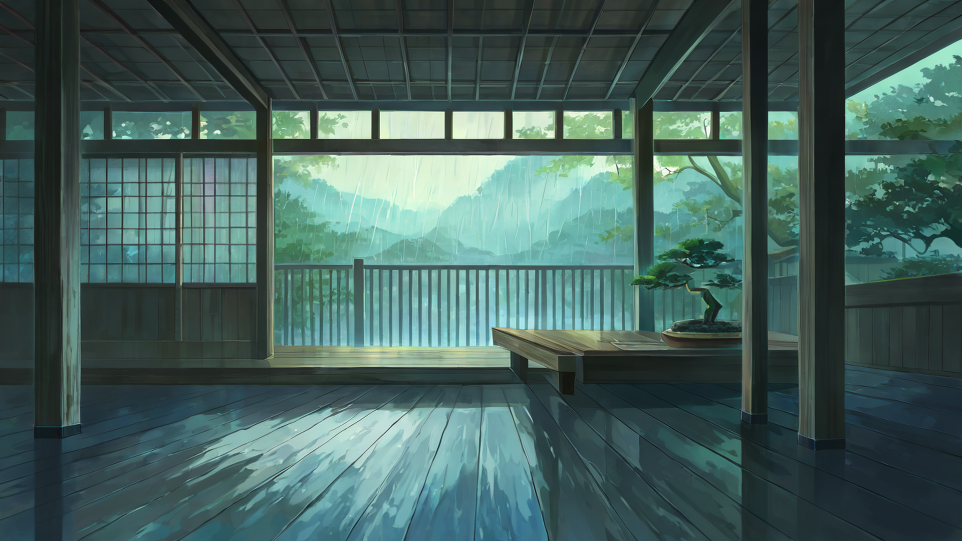
A few weeks after I launched this site, someone emailed asking whether the wallpapers came in 5120×1440. I had to look up what that even was. It turned out to be the Samsung Odyssey G9, a 49-inch curved monster with a 32:9 aspect ratio, and once I started digging I understood why he was asking a random lofi site instead of the big wallpaper platforms: most of them cap out at 3440×1440, which is 21:9, and the ones that do claim 32:9 support are usually just stretching a 16:9 image sideways until everything in it looks like it’s melting. So I added the resolution to our download pipeline, tested it badly, shipped it, and then spent an evening fixing what I’d broken. This post is the result of that evening plus everything I’ve learned since about what actually looks good on a screen that wide.
Why 32:9 defeats most wallpaper sites
The 32:9 ratio is essentially two 16:9 FHD monitors fused side by side, and that geometry breaks every lazy shortcut. Stretch a 16:9 image and faces and buildings distort horizontally — my first attempt at the resize did exactly this, and the preview of a torii gate looked like someone had grabbed both ends and pulled. Center the 16:9 image with black bars instead and you waste roughly 40% of the screen you paid a fortune for. And you can’t just go find real 32:9 photographs, because almost no camera shoots that aspect natively.
What does work, and this is the entire reason our collection exists in this resolution, is AI-generated horizontal panoramas: scenes whose subjects naturally extend sideways. Paths, rivers, mountain ranges, street scenes, rooftop skylines. When the subject itself is horizontal, filling a frame that’s five times wider than it is tall stops being a hack and starts being the natural way to compose the image. After I rebuilt the resize step to scale and center-crop from the source instead of stretching, every landscape theme on the site became genuinely usable at 5120×1440.
The themes I’d actually put on a G9
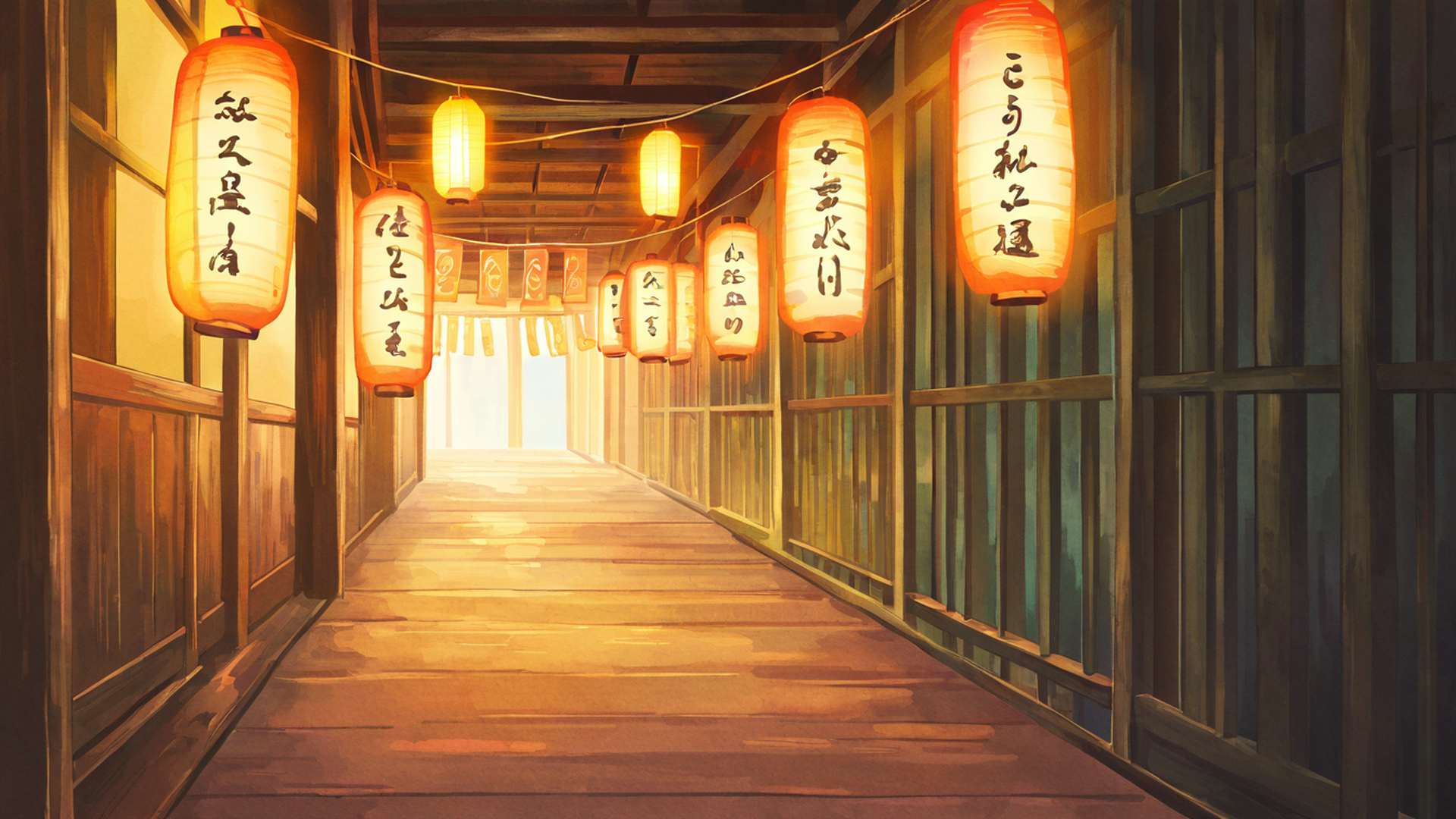
If I had to pick one starting point, it’s Lantern Festival Night. Thousands of lanterns strung across the scene extend horizontally on their own, so nothing important gets cropped, and the dark sky settles into a clean gradient across the full width — on the G9’s curve that gradient wraps slightly around you, which is the first moment the monitor feels worth its price.
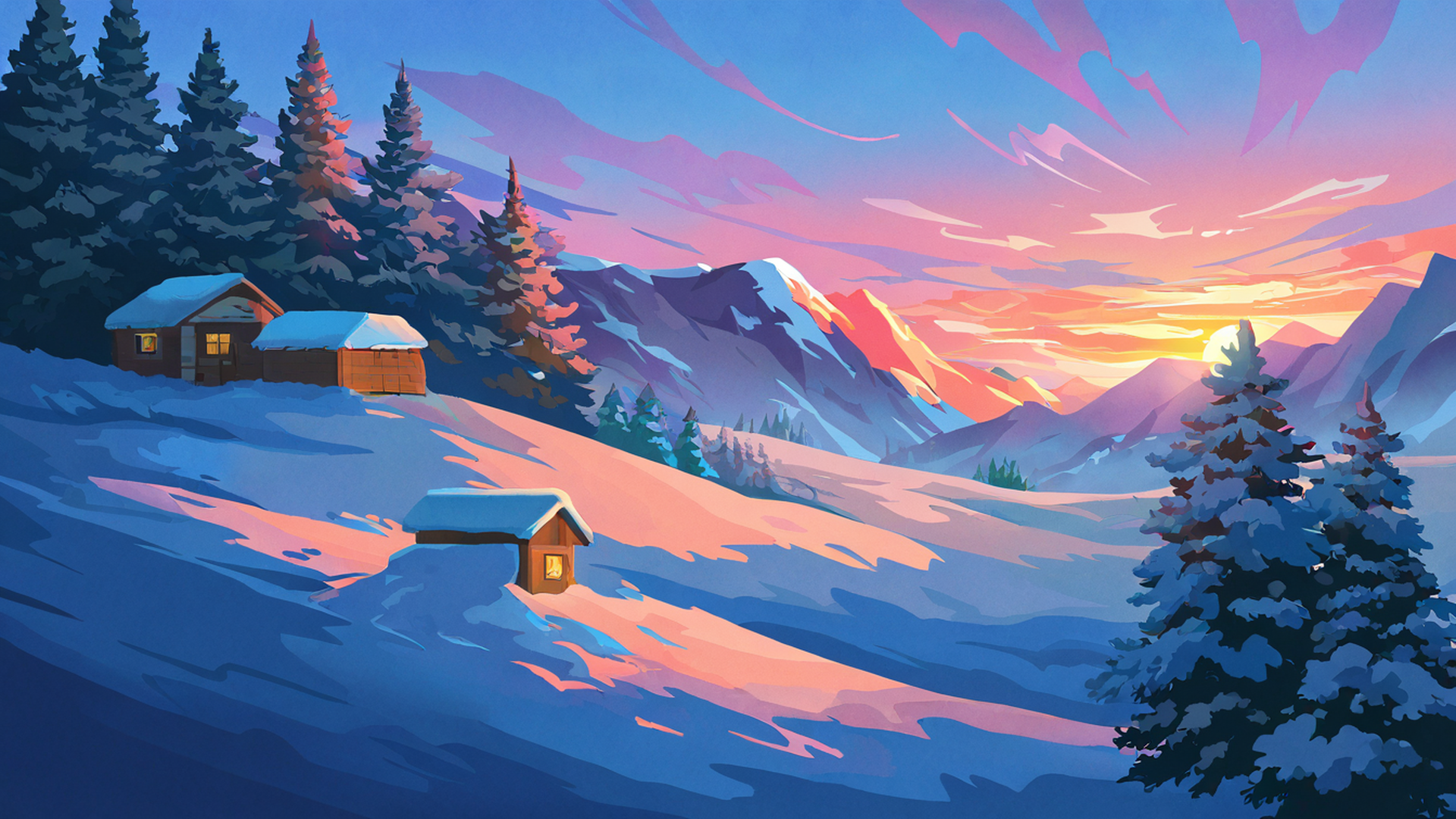
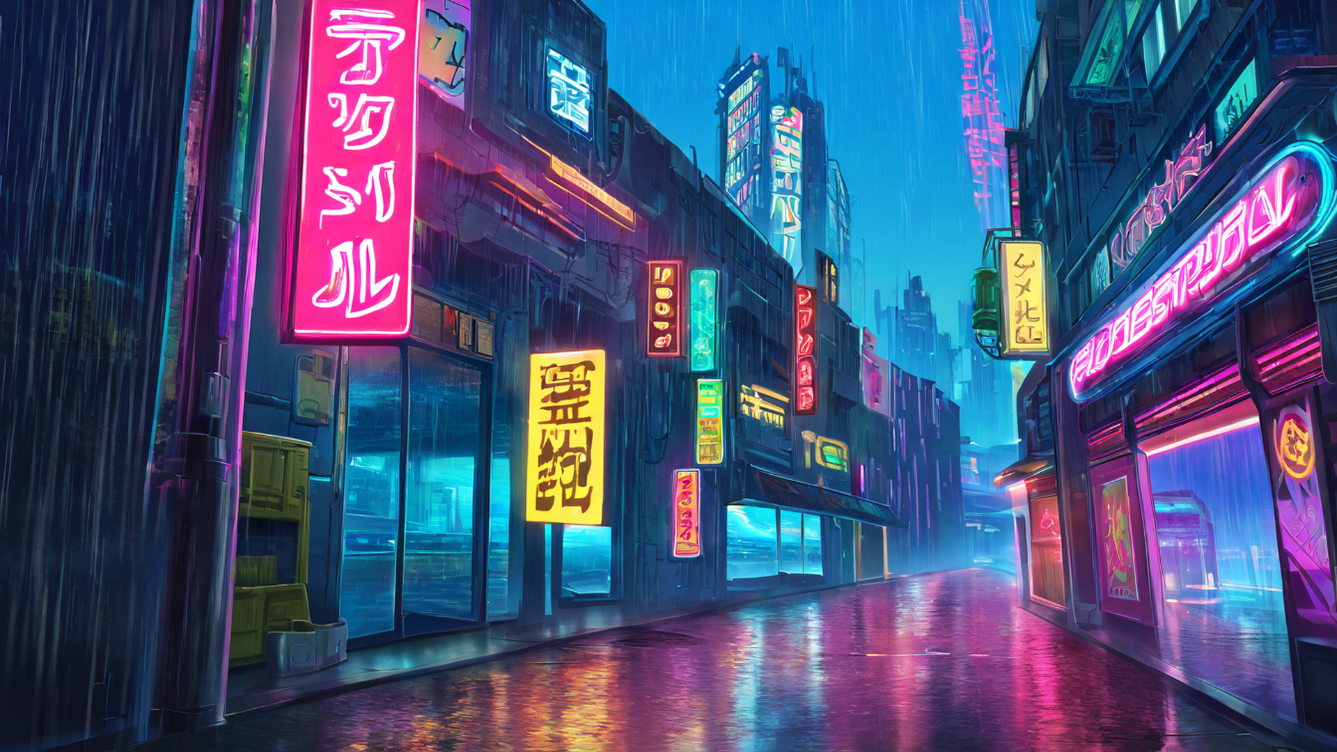
Night Market works for a blunter reason: it’s a street, and streets are horizontal by definition. Neon signs, lanterns, pavement stretching into the distance — the composition was pre-built into the subject before I generated a single image. Cherry Blossom Path takes the opposite approach, using a tree-lined vanishing point to create depth; those compositions exploit the full horizontal range instead of just tolerating it. When I want something that stays out of my way while I work, I reach for Rice Fields Summer — open landscape, subtle horizon, warm light, probably the least busy set in the whole collection. Snowy Mountain Village leans on the horizontal emphasis that mountain ranges have naturally, with small village details in the middle to reward a closer look. For gaming or dev setups there’s Cyberpunk Rooftop, skyscrapers and neon extending left and right with rainy streets below. And Seaside Lighthouse might be the best pure fit of all, because an ocean horizon is the one line in nature that genuinely matches 32:9.
Every resolution we render
The download picker on any wallpaper page offers the full ultrawide range. The resize happens on our server, scaling and center-cropping from the source to preserve composition — no stretching, ever, after that first embarrassment.
| Display type | Resolution | Example device |
|---|---|---|
| Ultrawide 21:9 FHD | 2560×1080 | Dell U34, LG 34” |
| Ultrawide 21:9 QHD | 3440×1440 | Samsung G5, LG 34GP83 |
| Ultrawide 21:9 5K | 5120×2160 | LG 40WP95C |
| Super Ultrawide 32:9 FHD | 3840×1080 | Dual 1080p setup |
| Super Ultrawide 32:9 QHD | 5120×1440 | Samsung Odyssey G9 |
| Triple 48:9 FHD | 5760×1080 | 3×1080p |
| Triple 48:9 QHD | 7680×1440 | 3×1440p |
Just pick the Samsung G9 line from the picker and you’ll get the native 5120×1440 file.
Setup mistakes I made so you don’t have to
Windows tries to be clever about wallpapers on ultrawide, and its cleverness is wrong more often than not. The fit option you want is Fill, not Span — right-click the desktop, Personalize, Background, Picture, and check it, because Span was the default on the machine I tested and it produced a smeared mess. While you’re in settings, switch to the dark theme. Our scenes are mostly night and dusk, and a bright white taskbar under a lantern festival looks like someone left the lights on in a cinema.
On rotation: my instinct was daily, and I was wrong. On a 49-inch screen the wallpaper sits in your peripheral vision for eight-plus hours, and swapping it every day creates a low-grade visual fatigue I only noticed after I stopped. Weekly turned out to be the sweet spot for me. And if you run a secondary portrait monitor next to the G9 — a common pairing — don’t stretch one image across both. Give the vertical screen something from our portrait collection instead: same aesthetic, actually fitted to the panel.
What I learned about composing for a screen this wide
Once the pipeline worked, I got curious about why some themes looked spectacular at 32:9 and others merely fine, and the answer is that the compositional rules genuinely change. A 16:9 frame has a strong center; your eye lands in the middle. On a 32:9 monitor the middle is far from both edges, and your peripheral vision is dominated by whatever occupies the wings. A single dramatic central subject — a lone figure, one tree, a torii gate parked dead center — leaves the outer thirds of the screen feeling abandoned. What works instead is distributed visual interest: several focal points spaced across the width, or one horizontal element that sweeps the entire frame, like a mountain range or a row of lanterns.
The horizon line matters more than I expected too. At double width, a high horizon gives you a huge panoramic sky, which is dramatic but overwhelming if the sky is busy; a low horizon feels oddly claustrophobic. The images that read best put the horizon slightly above the middle — enough sky to sell the width, enough ground for the eye to settle on. Depth helps in the same way. Scenes with three or four distinct planes, like our rice fields with crops in the foreground, hills in the middle, mountains behind and sky beyond, give the eye somewhere to rest as it scans sideways. A flat single-plane field just reads as undifferentiated space.
The most practical rule is the one nobody thinks about until they’re actually working: on a real desktop, the taskbar and your application windows live in the center, so the middle of the wallpaper is obscured most of the day. My editor covers it completely. The important visual content should sit in the outer thirds, and I now deliberately compose many ultrawide renders that way — our shrine torii variants frame the gate on the left or right rather than centered, leaving the middle free for terminal panels.
The failure modes are the mirror image. Portrait compositions stretched sideways look distorted and vaguely unsettling. Centered single-character scenes abandon the wings. Hot bright centers with dim peripheries pull your eye somewhere it can’t stay. Flat textures with no depth read as wallpaper-pattern rather than image at this width. The themes I named above — lantern festival, shrine torii, cherry blossom path, rice fields — are the ones we re-render specifically for ultrawide framing rather than trusting the algorithmic crop. Everything else is available at 32:9 too, but check the preview before committing, because not every scene was born for a frame this wide.
Where to go from here
If the cyberpunk rooftop caught your eye, the broader cyberpunk collection goes deeper in that direction, and the calmer Japanese landscape themes are what I keep on my own machine during focus sessions. Phone or tablet on the desk beside the G9? The portrait wallpapers match the same palette. Or head back to the blog — there’s more where this came from.