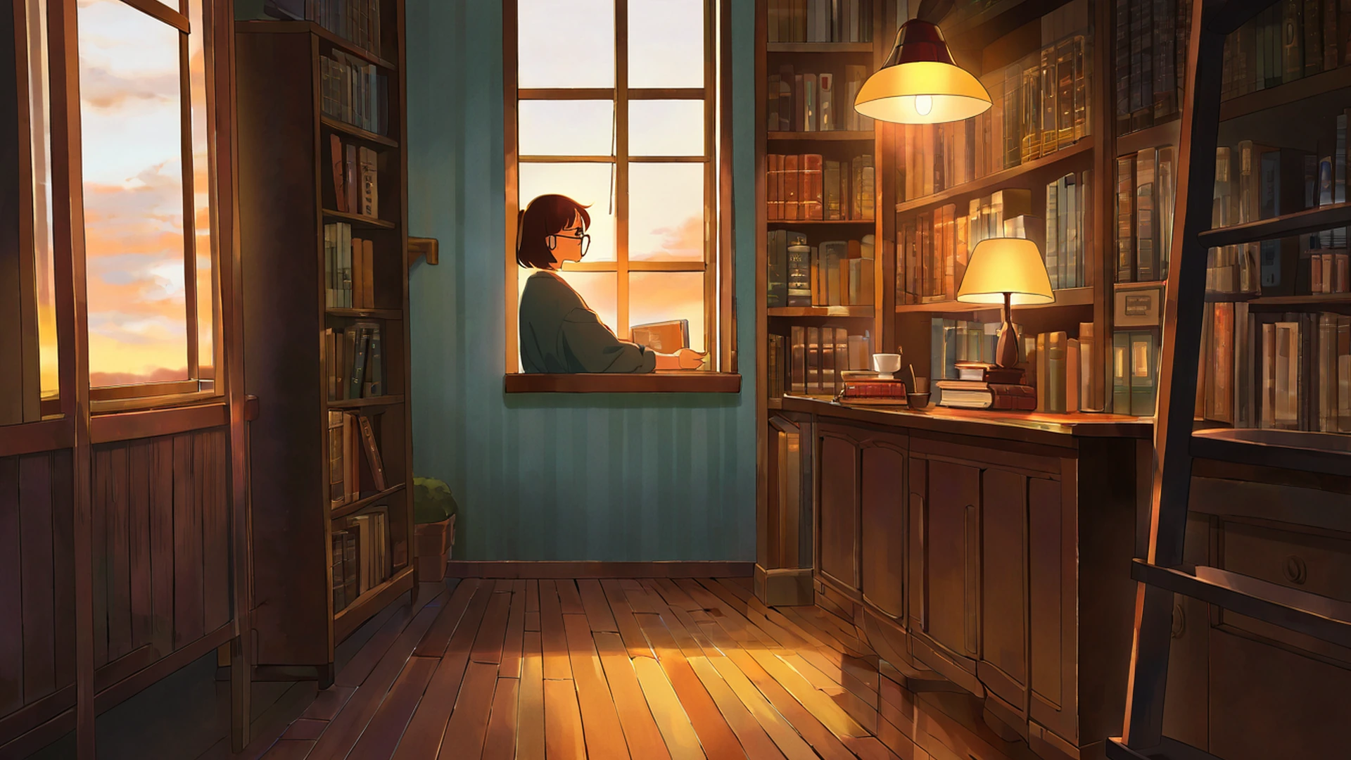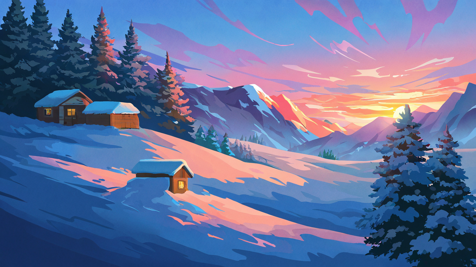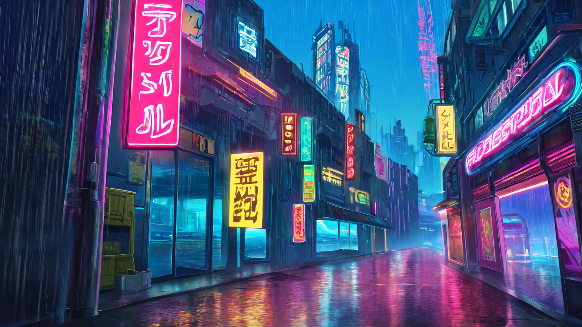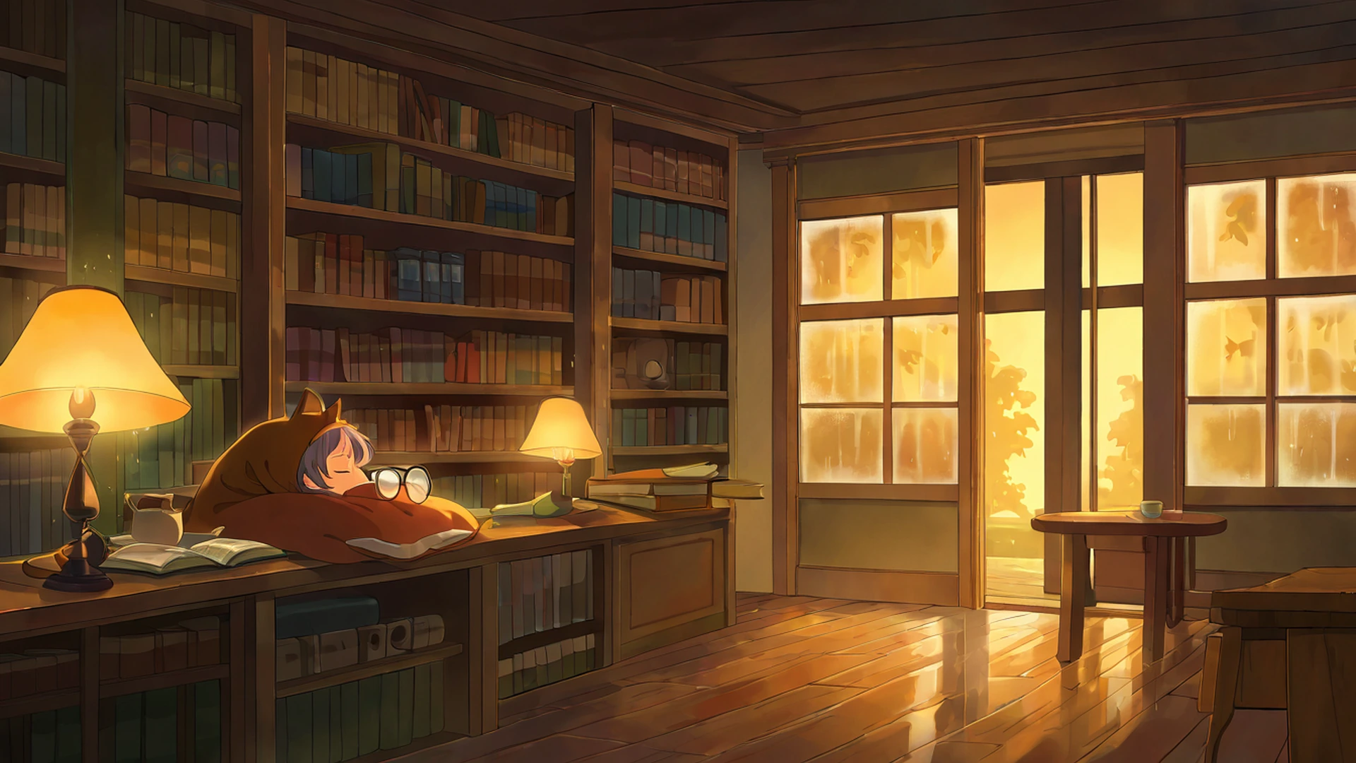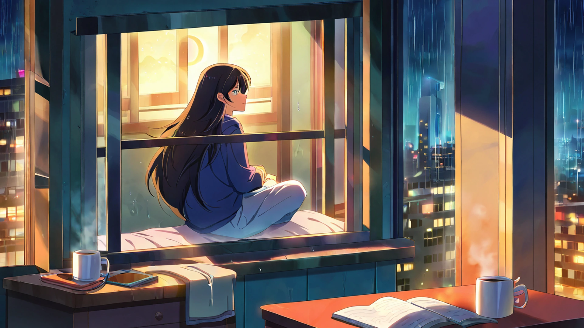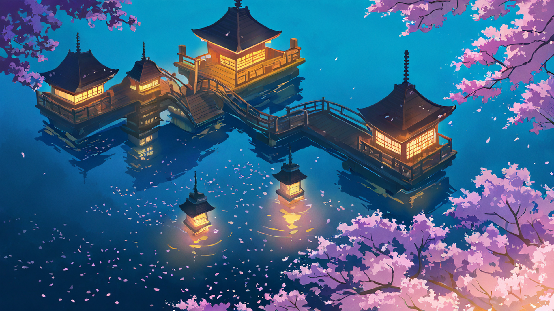
A lofi wallpaper, at the level of pure colour, is doing a very specific thing. Strip away the genre’s anime references and Studio Ghibli inheritance, and what is left is a small, recurring palette: warm amber and dusty orange in the highlights, a washed sage or moss green in the mid-tones, and a deep blue or muted teal in the shadows. The palette repeats from rainy bus stops to mountain shrines to cyberpunk neon alleys. It is the most consistent feature of the genre, more consistent than the subject matter, the time of day, or even the era of the source aesthetic. And it is consistent because of what colour does to the nervous system — not in a vague, vibes-based sense, but in measurable, replicable ways.
This essay is about that palette. What it is, where it comes from, why it works, and what it means for designers thinking about ambient or background visual environments more broadly.
The palette, plotted
If you sampled the dominant colours from a hundred well-regarded lofi wallpapers and plotted them in a perceptually uniform colour space — Lab or Oklch rather than the RGB grid most designers default to — you would see a cluster. The cluster sits in a narrow band of low-to-moderate saturation, midrange lightness, and warm-to-cool hue rotation that spans roughly from orange-amber (around 30–50° in Lab hue angle) through neutral green-grey (around 90–130°) into deep blue (around 240–260°). What you would not see is the high-saturation pure primaries, the harsh greens of fluorescent design language, or the cool greys of corporate interface design.
This is the palette of late afternoon light. It is what the world looks like in the hour before sunset, filtered through atmospheric haze, with shadows that are starting to deepen and lights that are warming. Cinematographers call this the golden hour and chase it with their schedules because it makes faces look healthier, skin tones richer, and three-dimensional volumes more readable. Painters have been chasing the same light since the Hudson River School in the 19th century, and traditional Japanese woodblock prints by artists like Hiroshige use almost identical colour relationships in their evening scenes.
Lofi as a visual genre inherited this palette by inheritance — from anime, from Ghibli, from the Tokyo street-photography tradition that influenced Cowboy Bebop, from the muted Tumblr aesthetic of the early 2010s — but the reason it stuck is independent of that inheritance. The palette stuck because human nervous systems respond to it consistently as low-arousal.
Why warm-low-saturation reads as calm
Colour perception is intertwined with arousal in ways that have been studied since at least the 1950s. The findings, simplified, are these: high-saturation colours (especially red, yellow, and orange at full saturation) tend to increase physiological arousal, measured by heart rate, skin conductance, and pupil dilation. Low-saturation colours of any hue tend to lower or maintain arousal at baseline. Cool colours — blues and greens — tend to lower arousal more than warm colours at equivalent saturation, but the effect is small compared to the saturation effect.
The lofi palette exploits this pattern thoughtfully. The warm tones are present, which keeps the image emotionally engaged rather than cold or clinical, but they are washed out — desaturated, often pushed toward a soft peachy neutral. The cool tones are present in the shadows, but they are not aggressive — they are deep navy or muted teal rather than fluorescent cyan. The mid-tones, the largest area of the frame, are usually a quiet sage or olive that sits close to neutral.
The result is a visual environment that registers in the visual cortex as “soft natural light” — exactly the input the system has evolved to relax in front of. We did not spend millennia under fluorescent office lighting and high-saturation screens; we spent them under firelight, candlelight, and golden-hour outdoor light. A palette that mimics those conditions reads as safe.
The role of the under-saturated screen
A subtle but important detail: lofi wallpapers are designed to sit behind icons, taskbars, editor chrome, browser tabs, and notification windows. The wallpaper is the visual background; the foreground is the work the user is doing. If the wallpaper is high-saturation, it competes with the foreground — every notification badge, every coloured cursor, every red close-button has to fight the wallpaper for attention. If the wallpaper is desaturated, the foreground colours pop because they are the only saturated thing in the frame.
This is one of the design principles you can see most clearly in macOS and Windows default wallpapers from the past decade: they have steadily moved toward more muted, lower-contrast palettes, and the operating-system colour accents have moved toward more saturated, more deliberate hues. The lofi aesthetic discovered the same principle organically. A wallpaper is not a poster. It is a backdrop, and the design rules for backdrops are not the same as the rules for objects of attention.
Hue rotation and emotional micro-narrative
A second feature of strong lofi palettes — and a place where the bad ones fall apart — is deliberate hue rotation across the frame. A weak lofi wallpaper picks two or three colours and applies them everywhere; the result feels flat and tinted, like a low-quality Instagram filter. A strong one rotates: warm in the foreground light source, cool in the deeper shadows, with neutral mid-tones bridging them. The result feels three-dimensional in a way that a flat colour grade does not.
The micro-narrative this creates is part of why the genre works as ambient art. A rainy porch scene, for example, might have warm amber light spilling from a window in the upper right, washing down through a sage-green wooden engawa, into deep blue shadows along the dirt path. The viewer’s eye traces the warmth-to-cool gradient without consciously analysing it, and the gradient itself tells a small story about light, time of day, and atmosphere. The eye relaxes into the story; the cortex registers narrative coherence as low-effort processing; arousal stays low.
A wallpaper without this hue rotation can be technically well-composed and still feel uneasy. The viewer cannot articulate why, but the eye keeps trying to find the light source, the shadow direction, the depth — and not finding them, never fully relaxes into the image.
The Japanese inheritance
The reason lofi as a genre inherited this palette so cleanly is that traditional Japanese visual culture has been refining it for centuries. The colour vocabulary of ukiyo-e woodblock prints — particularly the late Edo masters like Hiroshige and Hokusai — already uses muted earth tones, washed indigos, and warm ochre highlights against gentle gradient skies. The reasons are partly technical (the pigments and printing techniques of the period favoured these tones) and partly aesthetic (the cultural premium on shibui — refined, understated beauty — pulled toward exactly this kind of palette).
When 20th-century Japanese animation began to develop its visual language, Studio Ghibli in particular drew heavily on this earlier tradition. The hand-painted backgrounds of Spirited Away, My Neighbor Totoro, Princess Mononoke, and especially the lesser-known but visually pivotal The Tale of the Princess Kaguya all sit within a palette continuous with Hiroshige. When Cowboy Bebop and Lain in the late 1990s took that palette and applied it to urban modern subjects — rainy Tokyo alleys, neon convenience stores, late-night trains — they created the specific lofi visual genre that YouTube channels and Tumblr aesthetic culture later codified.
This lineage matters because it is the reason lofi feels aesthetically grounded rather than arbitrary. The palette is not just calming — it is calming with a centuries-long aesthetic vocabulary behind it, which gives any individual image a kind of inherited resonance that a brand-new palette could not.
What designers can borrow
For designers working on ambient, background, or supportive visual environments — not posters, not magazine covers, but the visual surroundings of focused work — the lofi palette suggests several practical principles.
Default to mid-saturation, not pure colour. Saturate deliberately and only in small accent areas. Most of the frame should sit in a quiet zone.
Use temperature contrast for depth. Warm highlights against cool shadows produce three-dimensional readability without requiring high contrast. This works particularly well in dark UI themes where contrast budget is limited.
Avoid pure black and pure white. Both are arousing because they signal extremes. Substitute deep navy for black and warm off-white or soft grey for white. The eye relaxes.
Trust hue rotation. A single dominant hue with subtle rotation across the frame is more legible and more atmospheric than a flat colour grade. Even small gradients matter.
Match the palette to the duration of viewing. A wallpaper is seen for hours; a poster, for seconds. Calibrate saturation accordingly.
These principles are not unique to lofi — they are, more or less, the principles of good background design across cultures and eras. Lofi just happens to be the most recent and most accessible distillation of them, and the genre’s popularity has put the principles in front of a much wider audience than traditional design education would have reached.
For readers interested in exploring the palette directly, our gallery is organised by theme; the cozy interior themes (rainy porch, bedroom window, bookshop) are where the colour vocabulary is at its most distilled, while the cyberpunk themes push the same principles in a saturated direction without abandoning them. — Lena