For about a year in my late twenties I was a fully paid-up member of the 5am club. Alarm at 4:50, cold face wash, journal, the whole ritual. Most of it didn’t survive contact with reality, but one part did: two or three mornings a week I’d walk to a café that opened at seven and work there until nine. That window — before the phones, before coworkers logged on, before the barista started the loud espresso runs — was reliably the most productive two hours of my day. Three or four strangers around me doing the same quiet, focused thing. A low murmur. Nothing else.
You can’t bottle that hour. Believe me, I tried, first with routines and now with pixels. But you can put a decent approximation of it on your screen, and that’s what this theme is.
The coffee shop morning collection came out of the first months of running this stream, and most of that time was me failing at it. My early attempts hit every aesthetic cliché I now tell people to avoid — a neon café sign in one, oversaturated latte art in another, and one image that was basically “girl in beanie typing on a MacBook” in stock-photo form. I threw all of those out. What survived is plainer than I expected when I started: empty rooms, warm light, real coffee equipment, and just enough world outside the window to anchor the scene to a specific morning.
Why a café works when your desk doesn’t
I went looking for research on this because I didn’t trust my own nostalgia for those 7am sessions, and the evidence turned out to be better than I expected. A 2012 study in the Journal of Consumer Research found that ambient noise around 70 decibels — roughly a moderately busy café — improves creative performance compared to both silence and louder environments. The proposed mechanism is called stochastic resonance: a small amount of background distraction makes rumination harder, which makes committing to one task easier. That matched my experience closely enough that I stopped being skeptical about it.
The other piece is what behavioral scientists call implementation intention. Physically going somewhere “for work” gives your brain a strong cue it learns to tie to focused effort. My theory when I designed this set was that you can fake a portion of that at home: your eye lands on the warm interior, the “café = focus” association loads, and the session starts a little easier than it otherwise would. Not as good as the walk to the real café. Better than a black desktop.
Where most café wallpapers go wrong
Having made every one of these mistakes myself, I can describe them with some confidence. The first failure is clutter: twelve cups, six people, a chalkboard, a pastry display, and rain outside, all in one image. Your eye has nowhere to rest and the wallpaper becomes a noise source instead of an ambient one. The second is palette. Cold blue or harsh white interiors fight whatever warm desk lamp you actually have on, and mornings in real coffee shops are warm by default — amber, honey, brass, brick. The third, and the one I feel most strongly about, is visible people. The moment a face appears in a wallpaper, your brain files it as a social presence rather than a backdrop, and you can’t unsee it. Every composition in this collection is deliberately empty of identifiable humans.
So the images here follow the inverted rules: one clear focal point — an espresso machine, a counter, a window seat — warm palette, nobody in frame. The result reads closer to a 17th-century Dutch still life than to a Pinterest café board. Quiet, anchored, and easy to live with for several hours, which is the actual job.
Three from the set
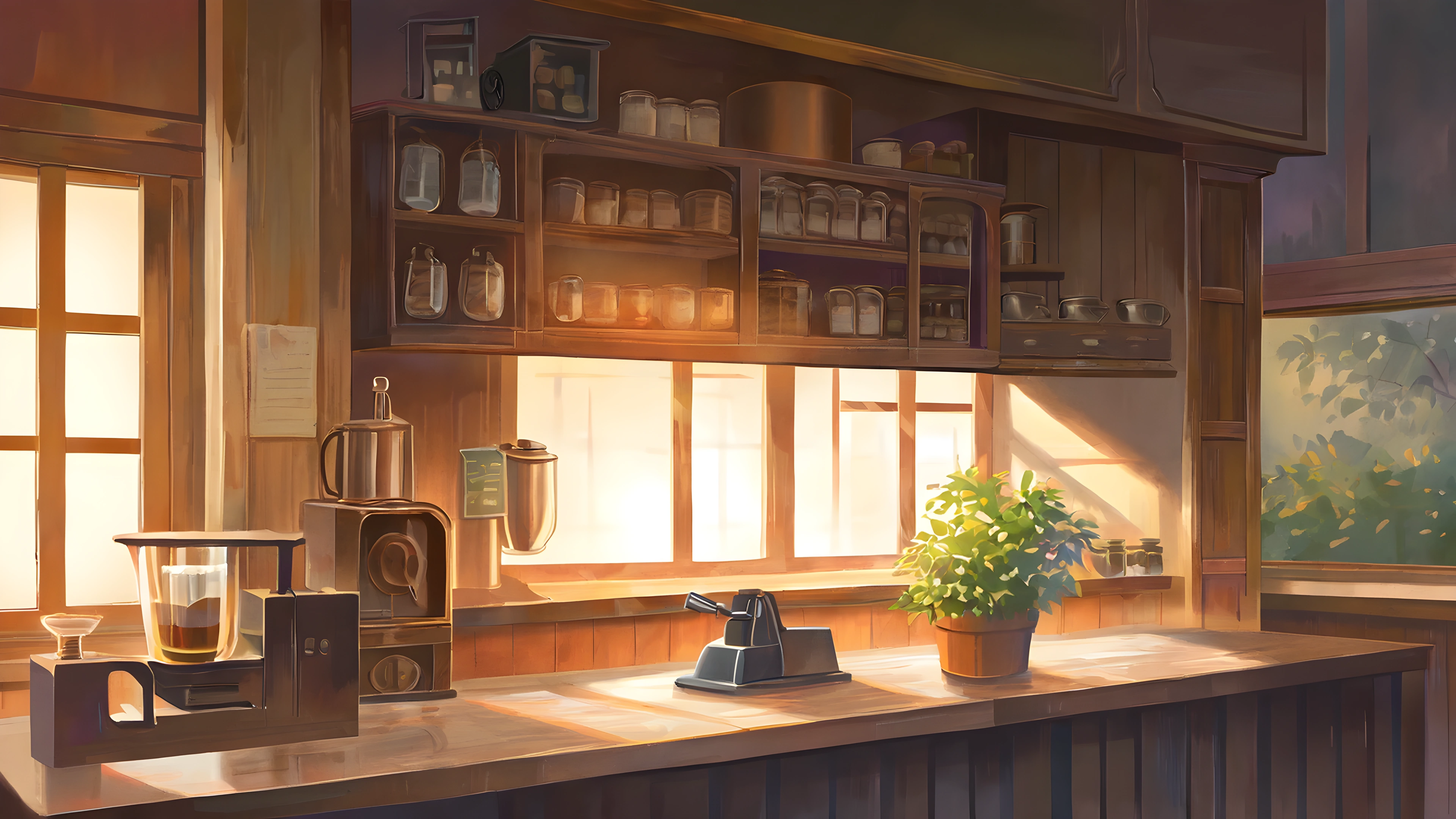
This is the one I’d hand to someone who wants a morning desktop background and nothing else. The amber light spreads across the whole frame and fades toward the edges, which conveniently leaves room for icons.
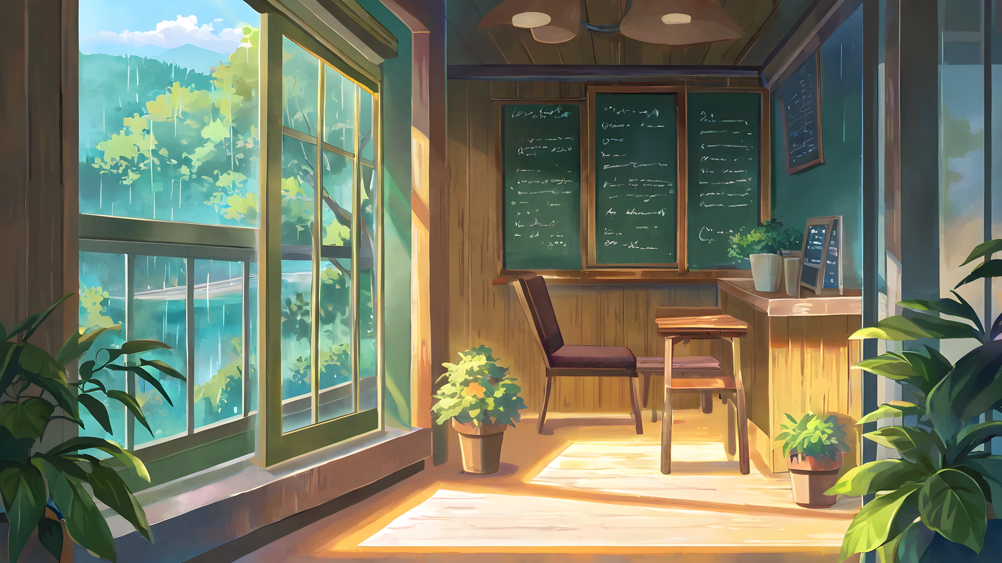
My pick for ultrawide displays. The horizontal counter line and the window framing extend cleanly across a 21:9 monitor without stretching weirdly, which is rarer than it should be.
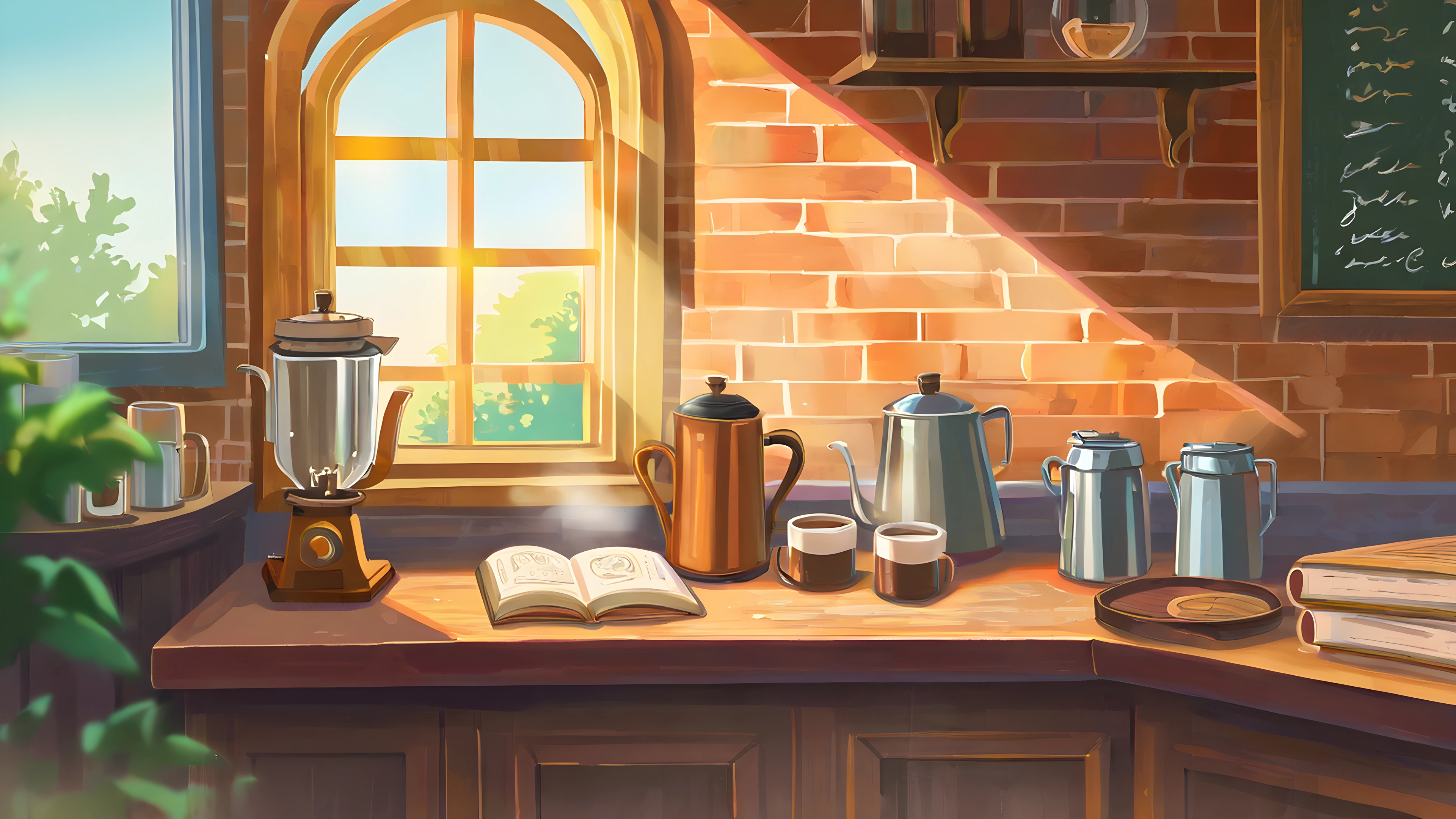
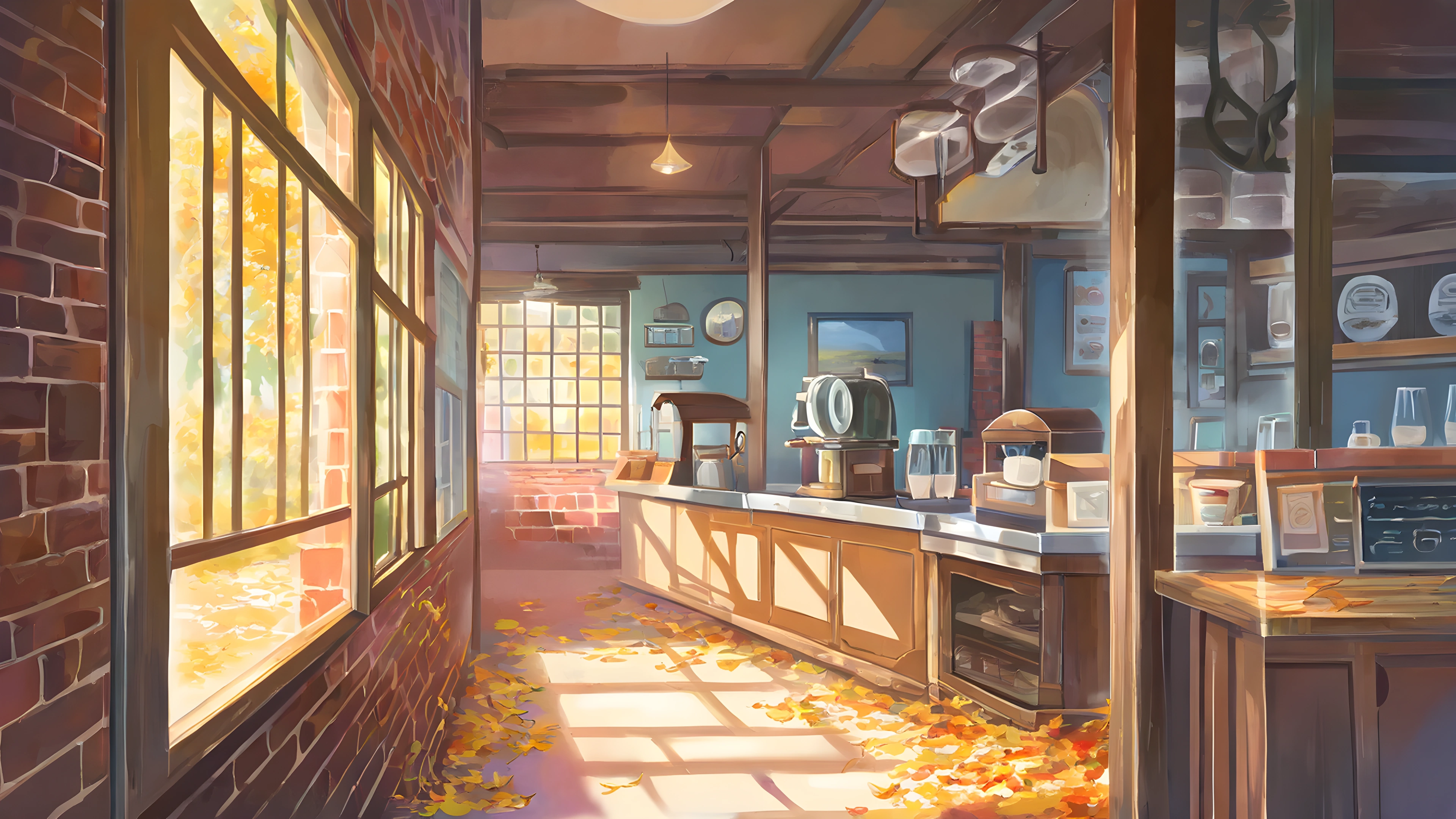
The classic coffeehouse look — clear espresso machine, exposed brick. Probably the most recognizable image in the set, and the one people download most.
The full set of fifty-plus images lives in the coffee shop morning gallery, with downloads at every common resolution from 1080p phone up to 8K desktop.
How I actually run it
A wallpaper alone is not productivity, and I’d be suspicious of anyone who claims otherwise. My own setup is a small stack. The wallpaper goes on at the start of a work block, not before. Under it I layer the café ambient loop from the homepage at low volume — gentle murmur, the occasional cup sound, no music — because the visual without the audio always felt like a photo of a meal to me. One warm desk lamp, screen brightness slightly lower than the lamp. Work blocks of 50 minutes, roughly Pomodoro-shaped, and I rotate between two or three images from the set so none of them goes invisible from familiarity. The wallpaper does exactly one job in that stack — it provides the setting — and the audio, lighting, and schedule do everything else.
The third place, or why this works at all
There’s a deeper reason café imagery functions as a focus background, and it has nothing to do with how any individual image looks. The sociologist Ray Oldenburg coined the term “third place” in his 1989 book The Great Good Place: the environment that is neither home (first place) nor work (second place), comfortable enough to relax in, social enough for low-stakes contact, structured enough to frame an activity. Cafés, libraries, parks, bookstores. A remarkable amount of culturally significant work happened in third places — Hemingway in Parisian cafés, Tolkien at the Eagle and Child, the whole intellectual culture of 17th-century coffee houses.
A coffee shop wallpaper is a visual proxy for that. If you’ve spent years working in actual cafés, your nervous system has learned to associate the cues — warm interior light, tables, a half-glimpsed espresso machine — with a specific state: alert but unhurried, social but uncommitted, focused but not isolated. It’s one of the best states for sustained analytical work, and a lot of people, me included, struggle to reproduce it at home no matter how nice the home office gets.
Why doesn’t it reproduce at home? Two reasons, and the wallpaper partially addresses both. The first is ambient social presence. Environmental psychology studies show that working near other concentrating humans — even strangers, even silent ones — measurably improves task persistence and reduces self-interruption. It’s the same mechanism body-doubling apps exploit; readers who mention ADHD tell me those apps are popular in their communities for exactly this reason. A wallpaper obviously doesn’t supply real humans, but the suggested presence — the cup on the next table, a hat left on a chair — primes some of the same pathways. The second reason is the environmental shift itself, what cognitive psychology calls context-dependent memory or encoding specificity: a task is easier in an environment your brain already associates with that task. A real café forces a sharp context shift because you physically travel there. A wallpaper gives you a weaker but real visual shift — provided you switch to it when work starts rather than leaving it up all day, so the change itself becomes a small ritual marker.
That last point is the practical core, so let me be concrete about how I’d use one as a focus tool rather than decoration. Rotate it in deliberately — on at the start of a focus block, off during breaks; modern OS wallpaper rotation makes this nearly free. Pair it with the café audio loop on our homepage, layered quietly under lofi; the illusion completes surprisingly well. Match the image to the work mode: these morning scenes feel off-register at night, when bedroom window night or lantern festival fits better, and OS Focus modes can pair wallpapers to blocks automatically. And don’t let it replace visiting an actual café. The real thing gives you human contact, natural light, and the small disruptions that keep isolation fatigue away. The wallpaper is a proxy for when you can’t go, not a reason to stop going.
Used that way, it’s closer to a small environmental intervention than a decoration. It does one specific piece of cognitive work, and you keep most of the benefit if you respect what that piece is.
Nearby shelves
If this theme lands for you, three sibling collections hit a similar register without repeating it. Vinyl record shop is the same warm-interior idea built around a music shop. Cozy bookshop is even quieter — books instead of coffee. Bedroom window night is the enclosed-warm formula moved to the other end of the day. The full theme list has the whole catalogue if you’d rather browse.
I’m aware of the obvious risk in a post like this: dressing up “I made some wallpapers” as more than it is. So, plainly: these are AI-generated images, made for one narrow purpose — a morning focus background — and they’re free to download. Use them or don’t. If one of them makes a single work session this week feel a little more like that quiet 7am café hour I used to chase, that’s enough for me.